Slightly Imperfect


Slightly-Imperfect- JGF - 102315_1(k)

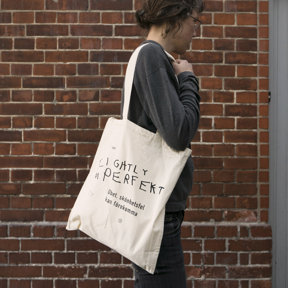
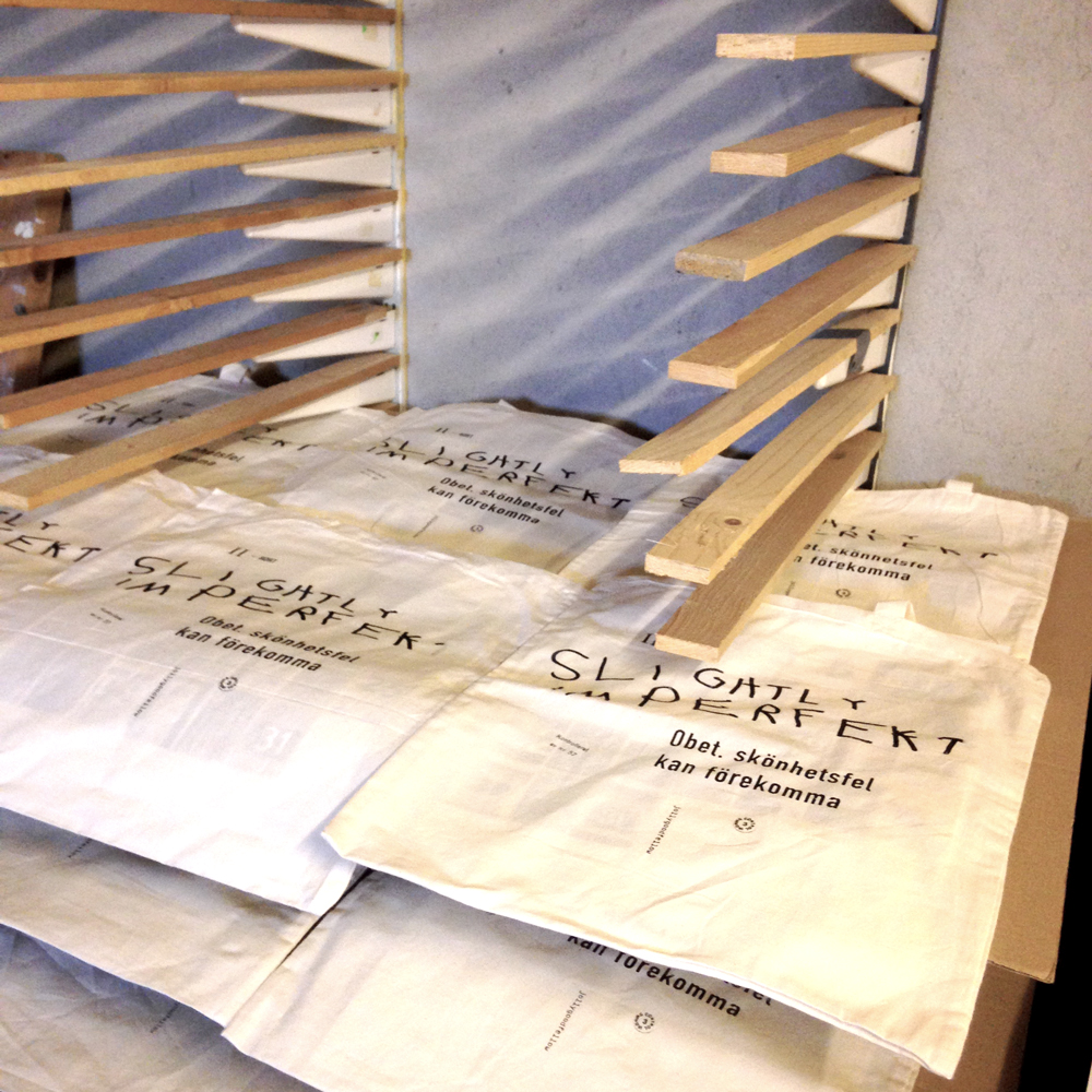
The pile of irregular tote bags have grown big, so we were thinking of something to do with them. Maybe turn them into pillow cases? But then we thought of an old print idea that has been in the drawer (or sketch book) for many years.

Slightly-Imperfect_marks

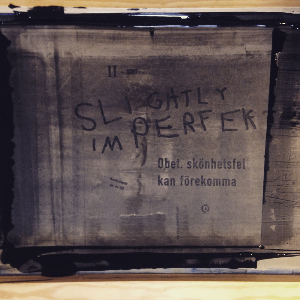
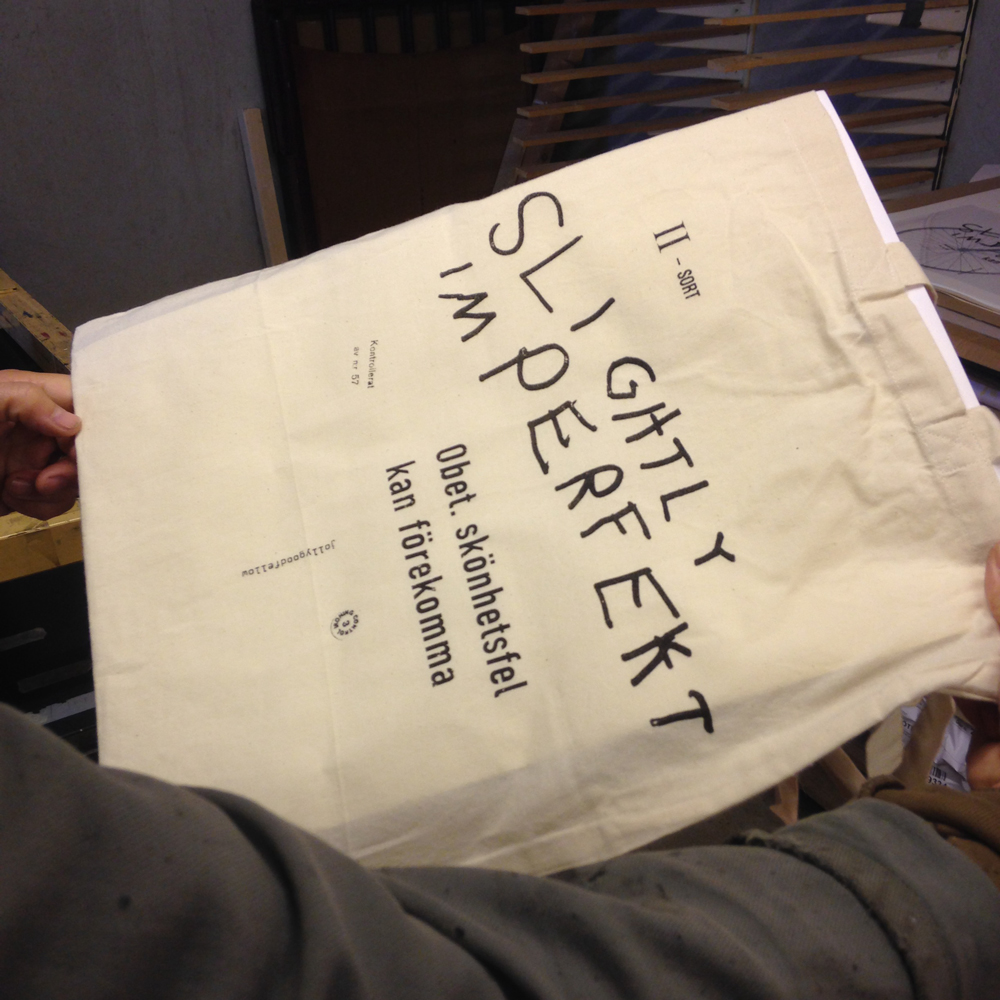
We have collected small marks for “irregular quality” during the years. The first one’s were found on cheap t-shirts and underwear bought in New York in the 1990’s.

Now we have let them be the main motif on some bags!

Slightly-Imperfect_printing01 Slightly-Imperfect_printing02 Slightly-Imperfect_printing03

Slightly-Imperfect_printing04

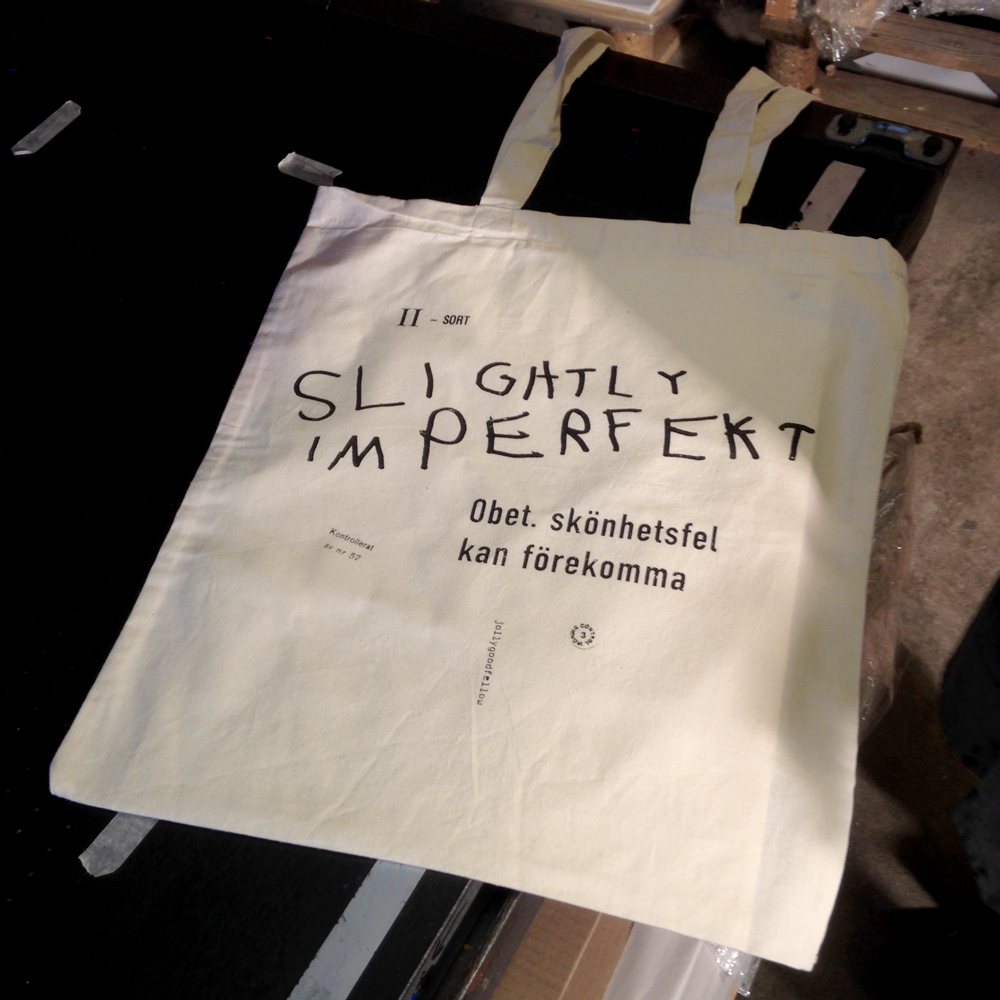
The expression ”slightly imperfect” is kind of funny. It sounds humble but at the same time says ”almost perfect”. Like the swedish expression ”Obetydliga skönhetsfel kan förekomma” which means something like ”insignificant beauty imperfections might occur”. And who doesn’t feel like that at times?


By |2020-04-17T11:17:25+02:00October 23rd, 2015|CARRY, inspiration, process|Comments Off on Slightly Imperfect

Tvättbrädan

Tvättbrädan-46x64_Wagon-P1000516

An old object that (almost) no one use any more. We found the original for this washboard in our cottage on the Finnish countryside some years ago. Probably Esa’s grandmother worked hard in the quite to get the cloths clean, back in the days. Sometimes its good to be reminded about how people used to value and take care of their cloths and objects, we have a lot to learn from the past when it comes to sustainable living.

Photo 2015-04-27 11 29 29

Photo 2015-04-27 11 29 09
It’s also fun to see how it can be used as a DIY-rhythm instrument.

And actually the first idea when we found the washboard, was to print t-shirts as a comment to the hysteria about our bodies. Let us know if your are interested, maybe we will print some t-shirts!

You can find Tvättbrädan in the jollygoodshop


Tvättbrädan_46x64_detail-P1000119 Tvättbrädan-46x64_Wall-P1000220

By |2020-04-17T11:17:25+02:00May 22nd, 2015|ON WALL|Comments Off on Tvättbrädan

Exhibition at manos!

Foto 2015-04-07 14 35 51

Manos in Stockholm started to sell our handprinted baby cloths many years ago. We love their mix of design and craft, actually they were our first reseller ever which makes them extra special. This spring we had the opportunity to hold an exhibition at manos and meet a lot of old and new friends.

Foto 2015-04-10 12 03 09

Foto 2015-04-10 12 12 06

Foto 2015-04-10 15 20 22

Foto 2015-04-11 17 11 39

Foto 2015-04-11 17 12 34

Foto 2015-04-11 14 21 20

By |2020-04-17T11:17:25+02:00April 24th, 2015|ON WALL|Comments Off on Exhibition at manos!

Go!

goWe like bikes and typograpy – in this print we has combined them both, Go!

By |2020-04-17T11:17:25+02:00October 6th, 2014|ON WALL|Comments Off on Go!

Stålfarfar


It started as a play with bike parts and tools, but then we saw him – Stålfarfar! It made us very happy because we have read a lot about Stålfarfar and his story has been a great inspiration to us. Of course we had to make a screen print!

 Wikipedia says:

In 1951, at 66 years of age, Håkansson rode his bicycle emulating the so-called Sverigeloppet from Haparanda to Ystad. Because of his advanced age the organizers had refused him to participate – the maximum age was 40 years – but he still started from Haparanda, formally not among the contestants but starting one minute after the last of them had set off and wearing a shirt on which he had written a big zero as his ‘runner number’. The Tour was run in stages, and while the contestants slept, Håkansson would pedal up to three days without sleeping. During the contest, he was presented as “Stålfarfar”, a name that had followed him since the late 1940s. He had a big beard that made him look extra old, and the organizers were afraid people would laugh at the race participants. Many newspapers were covering his story, and he became famous as the nation followed his journey through the country.

During a few hours off in Söderhamn the police asked him to take a medical exam, which showed that Hakansson was in good health. After 6 days, 14 hours and 20 minutes, he arrived in Ystad – 24 hours before the contestants.


By |2020-04-17T11:17:25+02:00August 13th, 2014|inspiration, ON WALL|Comments Off on Stålfarfar

Urban Cube Calendar

The idea came up for the first time when we biked around looking for numbers for urbnCal 2012 in Helsinki, where many of the street numbers were placed on light cubes. One of the ideas with our wall calendar urbnCal was to make something physical in a digital world. In this calendar we are taking it one step further, the cubes are meant to be handled daily and turned to the current date. Another important part is that you can use it for many years, it’s a sustainable fellow.

12 street numbers screen printed by hand on quality cardboard from Norrmalms Kartongfabrik, glued together in the shape of cubes.
The calendar is inspired by Esa’s mother who every morning grabbed two small wooden cubes and turned to the date, then the weekday and sometimes the month. Our version of the calendar is reduced to just show the date to get a stronger and clearer expression.


By |2020-04-17T11:17:25+02:00August 10th, 2014|CALENDAR|Comments Off on Urban Cube Calendar

Arvo

Ten years ago, when we started screen printing together, Esa played around with roots. It became prints on some t-shirts with roots in different compositions. One of them was a play with the similarity between roots and hair, a calm man with a long beard of roots and eyes made of the letters a and p.

When we started to think of all the old prints we have left behind, we felt that we really wanted to give “Arvo” a second life. This time we worked further on the shape of the beard to get it look more like the real Arvo beard sitting on the chin of Arvo Pärt (one of our favorite composers in terms of modern classical music). This is not supposed to look like a portrait (as you see) but we think it turned out pretty well and gives, at least us, a feeling of Arvo Pärt and his music.

Here it is, the poster Arvo! And of course you find him in the jollygood shop as well.


By |2020-04-17T11:17:25+02:00March 7th, 2014|ON WALL|Comments Off on Arvo

Världsmästarcykeln in colour

When we had printed Världsmästarcykeln and Världsmästarcykeln XL we knew immediately that we wanted to continue to work with the bike theme. We started looking for other models and we have received several suggestions, but we still felt that we were not really finished with Världsmästarcykeln. For us it is somehow the bike. Then came the idea to start print it in color. And we thought, why not try? You are usually able to choose the colour of a bike when you’re in a bike store, so why not fix some new colours on our bike for spring 2014.

We have carefully mixed a colour which we think is near the orange hue we associate with Crescent’s World Championship bike. And we added a bright green and a really dark purple. Colours that are intended to work both together and separately.

When we stood at the printing table, we became so fond of the combination of mint green / purple that we printed a version with both colours, one above the other. So here are the spring colours according jollygoodfellow.


By |2020-04-17T11:17:25+02:00January 22nd, 2014|ON WALL|Comments Off on Världsmästarcykeln in colour