Picnic at FORMEX
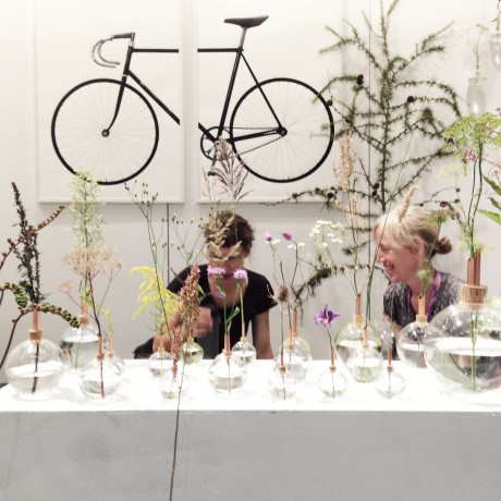
This time we exhibited together with scandinaviaform at Formex. It was a very good choice since we could enjoy a little meadow, which felt so nice together with the prints.
This time we exhibited together with scandinaviaform at Formex. It was a very good choice since we could enjoy a little meadow, which felt so nice together with the prints.
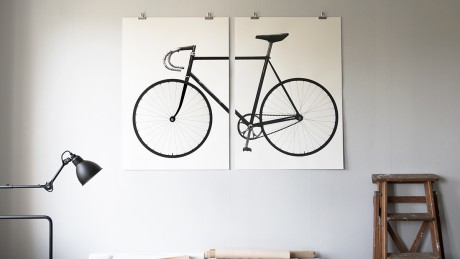
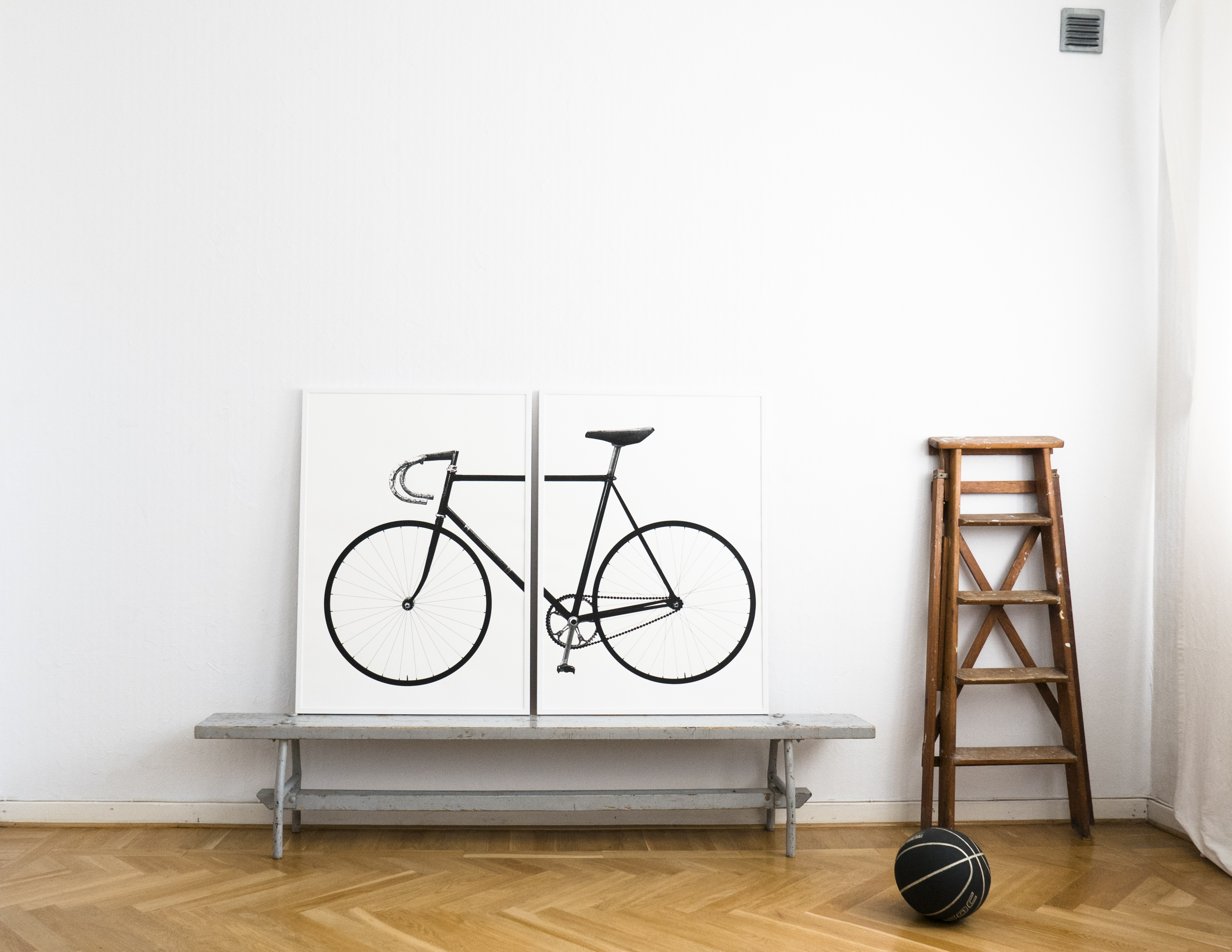
Finally our new big bike print is on the wall!
After months of watching and discussing just the two of us and with really nice bike people we decided that the bike that Eddie Merckx used for his “Hour Record” 1972 in Mexico City should be the object for our next XL bike print. The bike is clean and nice, very close to the image that pops up in our heads when we hear the word bike. And Eddie Merckx seems to be a very nice cyclist who has continued his bike journey in a nice way.
We fell over a long essay about the mystery: which bike is the bike that Eddie actually used during the record? We started to compare the different versions and still were not sure about which of them is “the bike” but at least we have quite good odds as we have used parts from to different bikes ; ) One of the bikes is shown at the Eddie Merckx Subway station in Brussels and we where on our way to picture it but halfway there we had to change our plans due to the awful terror acts in Brussels during Easter week 2016.
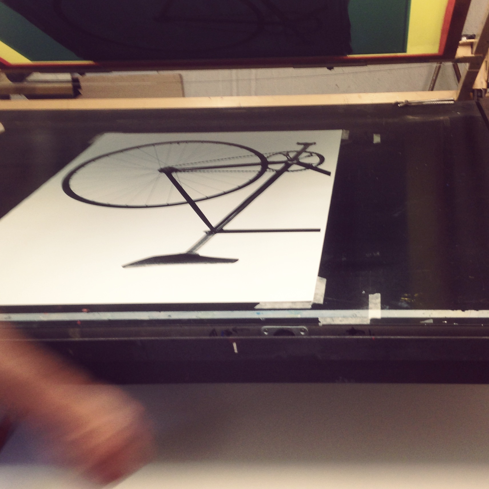
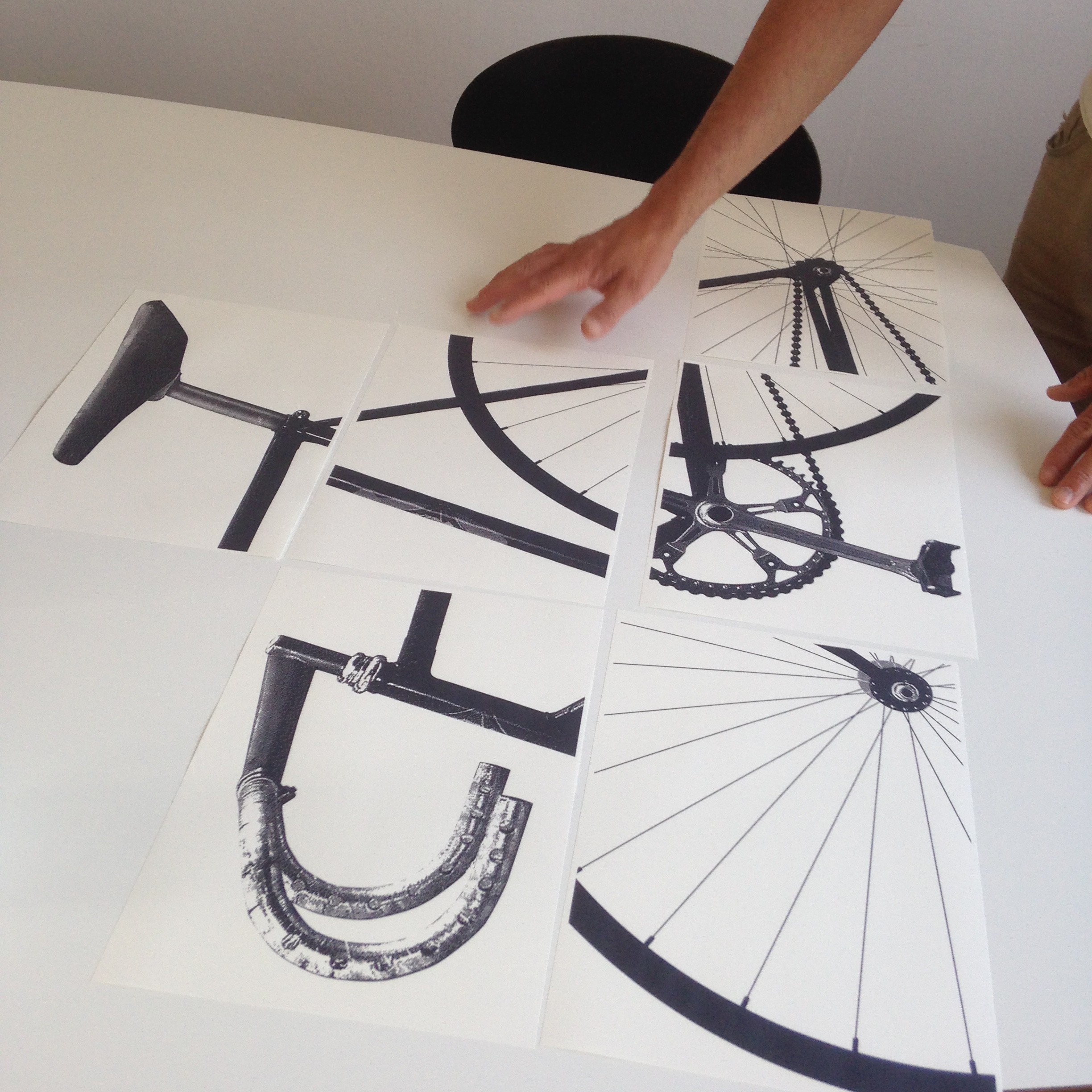
Ride in the print shop.
“Ride as much or as little, or as long or as short as you feel. But ride.”
That is a quote from Mr Merckx that we really like and the reason we gave this print the name “Ride”.
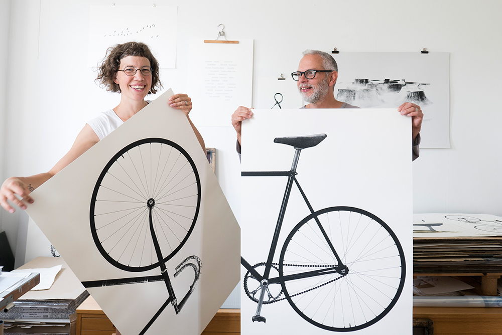
This time we are using a heavier off-white (or cream shade) paper from the Swedish paper mill Munken. It feels and looks very nice.
Short info:
RIDE XL
Size: 70 x 100 cm x 2
Paper: Munken Pure 300 g
Technique: photo based screenprint
Edition: 750
Handprinted in Arlöv Sweden
by Esa and Lisa Tanttu – jollygoodfellow
If you want press images or have other questions please contact info@jollygoodfellow.se
When we started up the jollygoodfellow printshop many years ago the focus was on t-shirts. But now most of the prints are on paper (posters). Some times we miss it, but we realize that we haven’t time to do it right now.
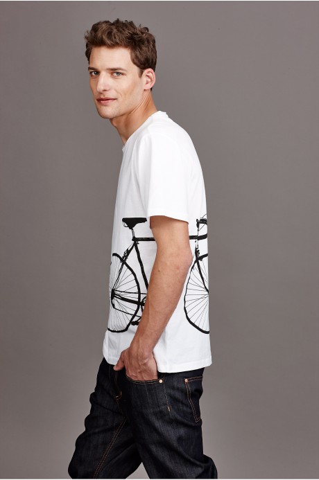
When Petra Backlund from Close by Denim asked us if we wanted to collaborate it felt so right, especially since we share the same values (environmental friendly production and products, local production as far at it’s possible, products with long life etc). We really like their tag line “CLOSE by DENIM is brought to life from a spirit of mindful spending.” Now the first t-shirts are launched and we are looking forward to continue the collaboration!
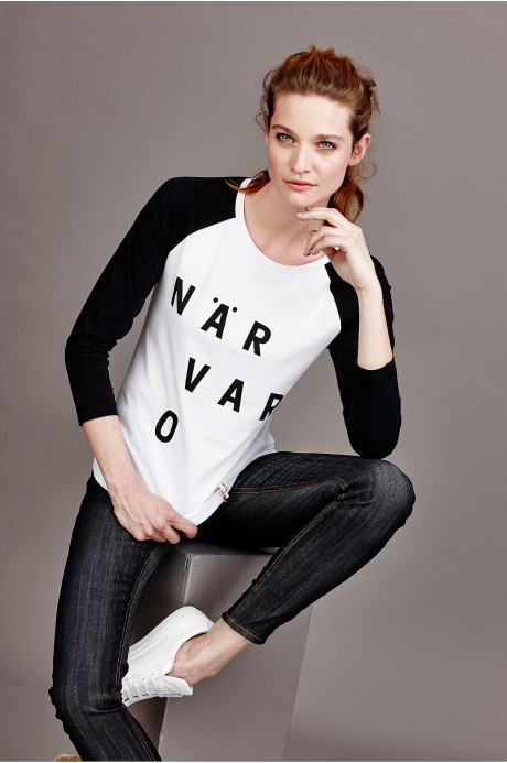
Photo: CLOSE by DENIM

Most of the time we use black paint in the printshop but it is something special with colour as well.
It’s really exciting when we stand there with the primary colors: cyan, magenta, yellow, white and black and try to concretize the idea of a colour we have in mind.
Here is the new colours, GREEN, BROWN and VIOLET

Världmästarcykeln Green, 64 x 46 cm, printed on Munken Pure.

Världmästarcykeln Brown, 64 x 46 cm, printed on Munken Pure.

Världmästarcykeln Violet, 64 x 46 cm, printed on Munken Pure.
 We like bikes and typograpy – in this print we has combined them both, Go!

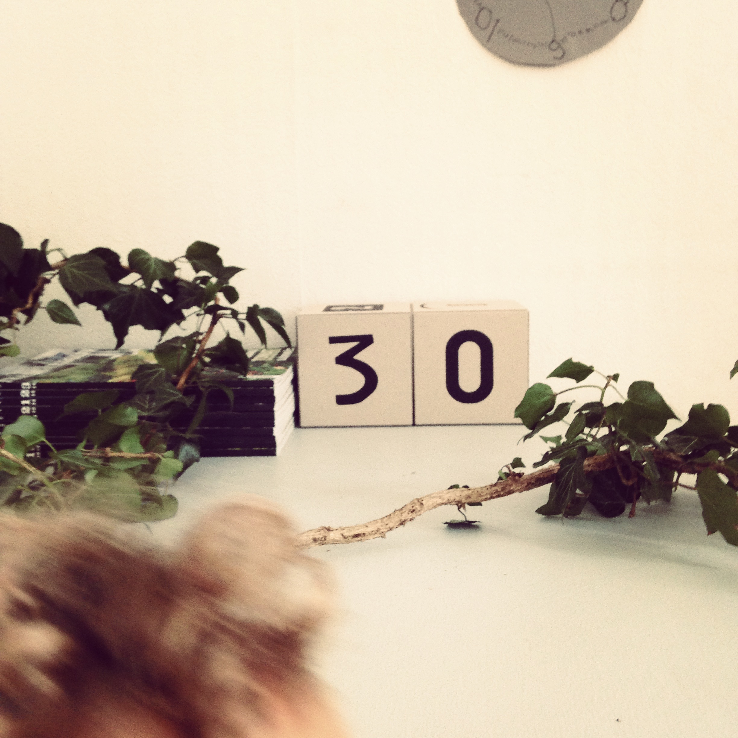
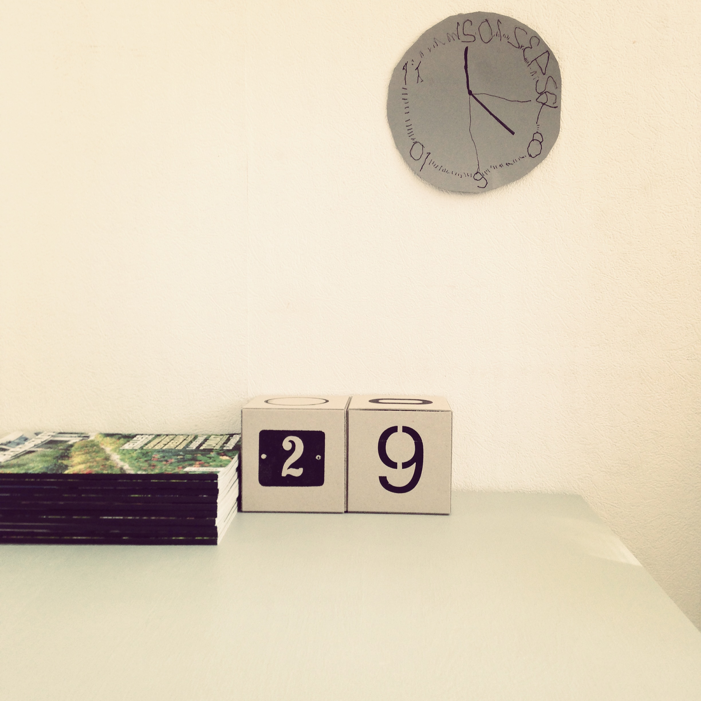
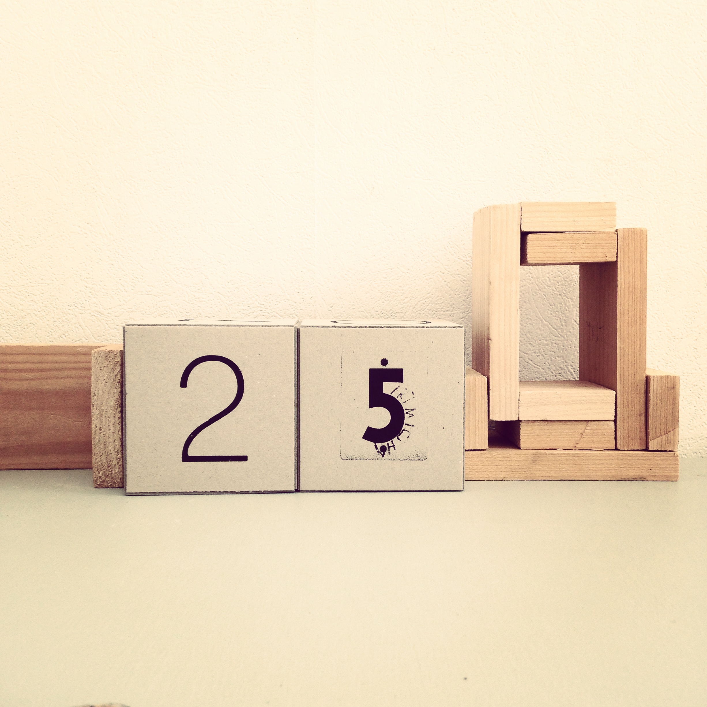
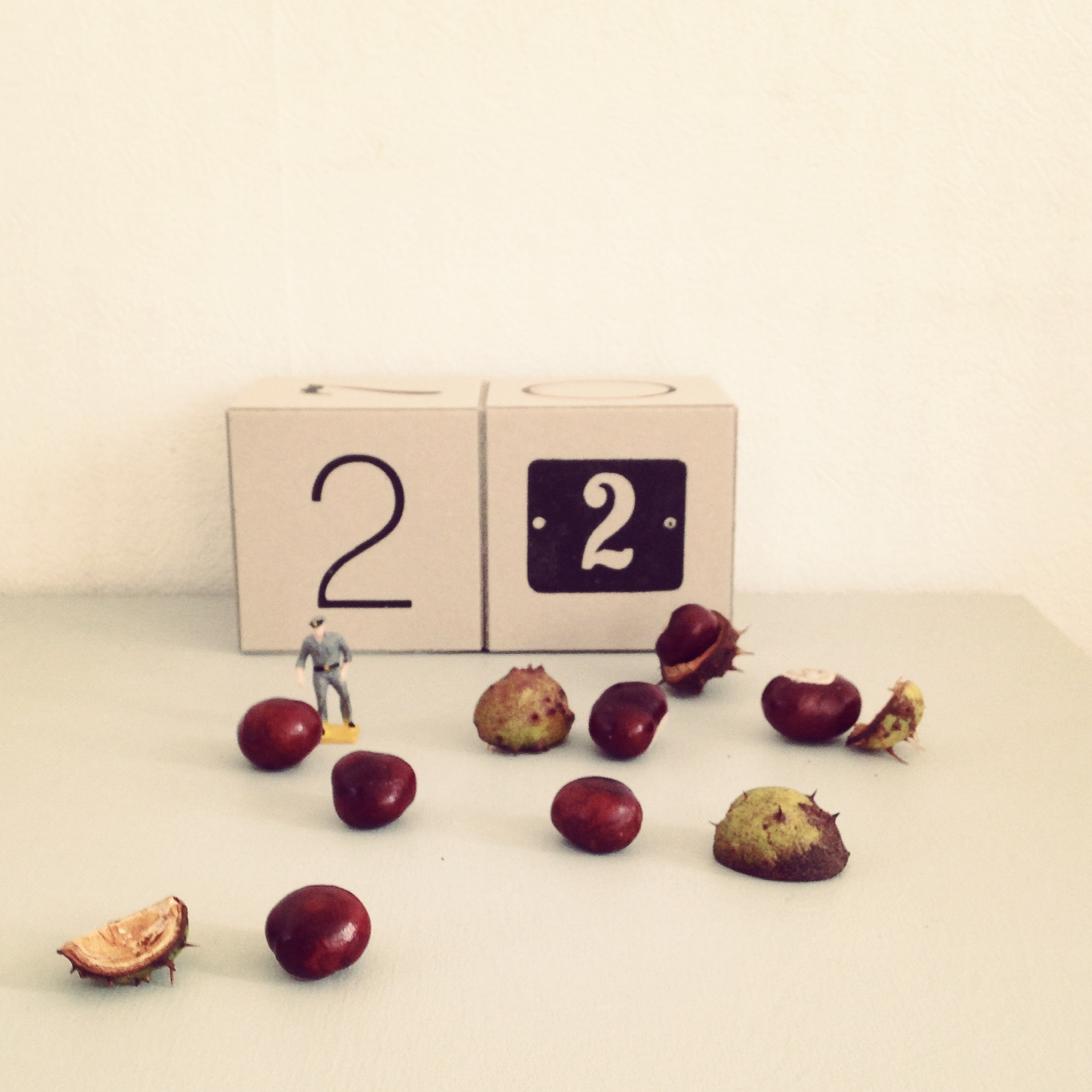
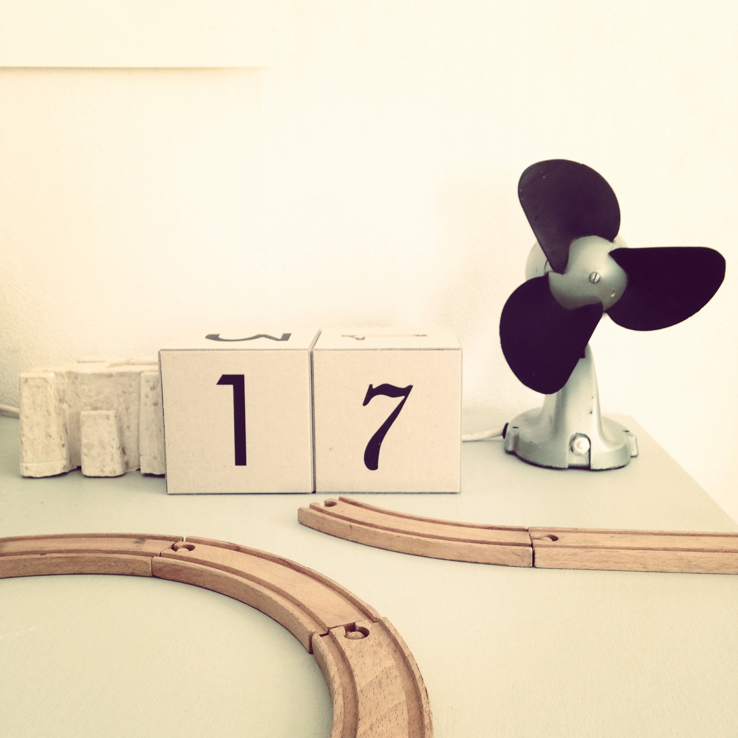
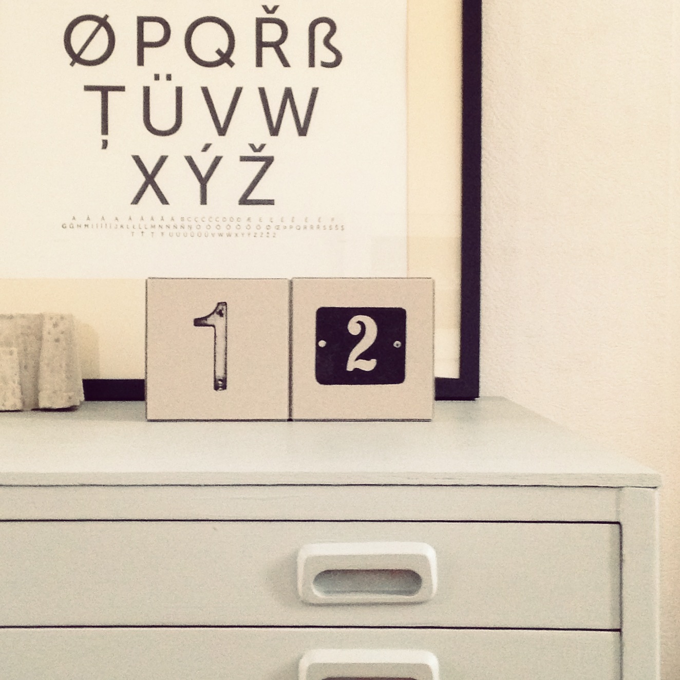
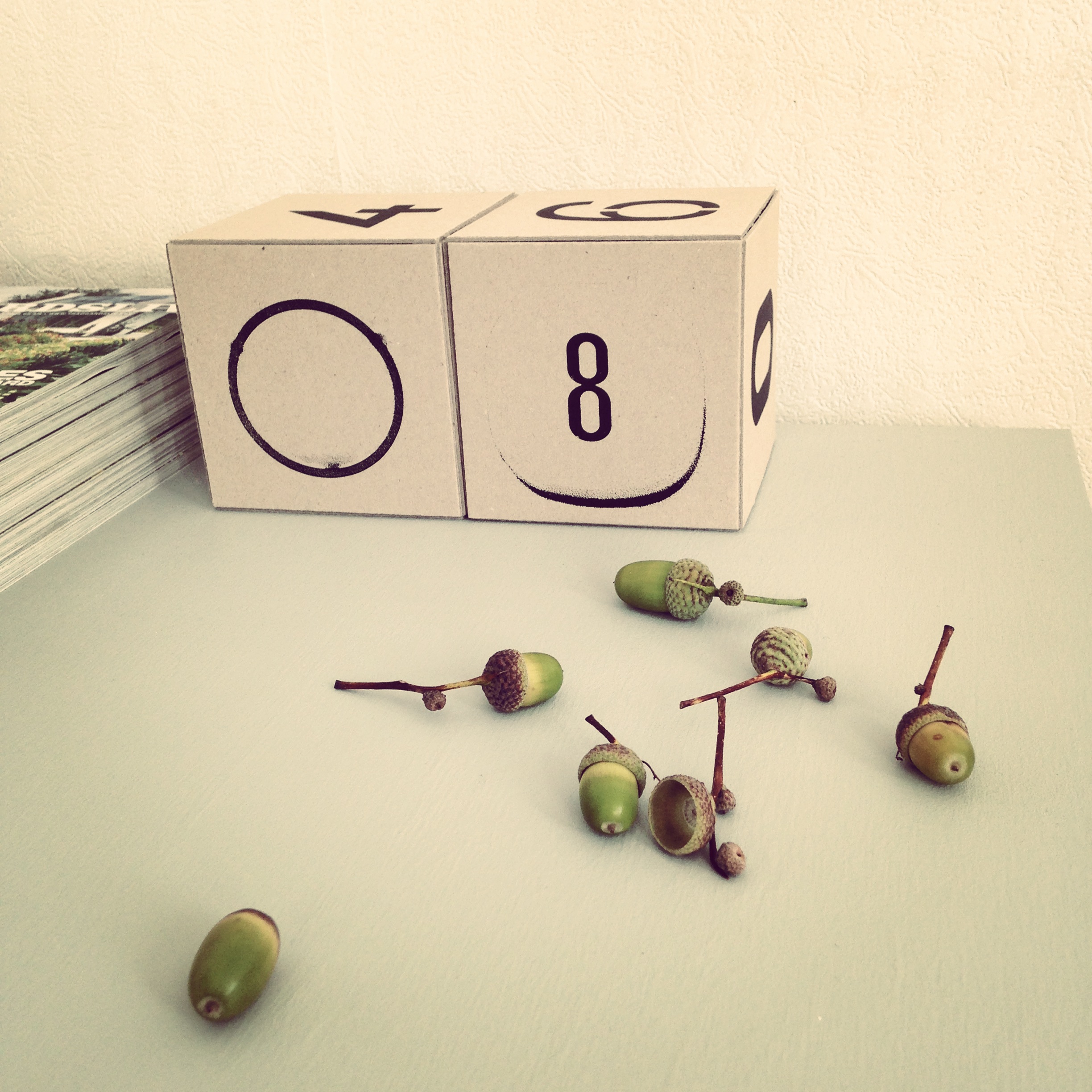
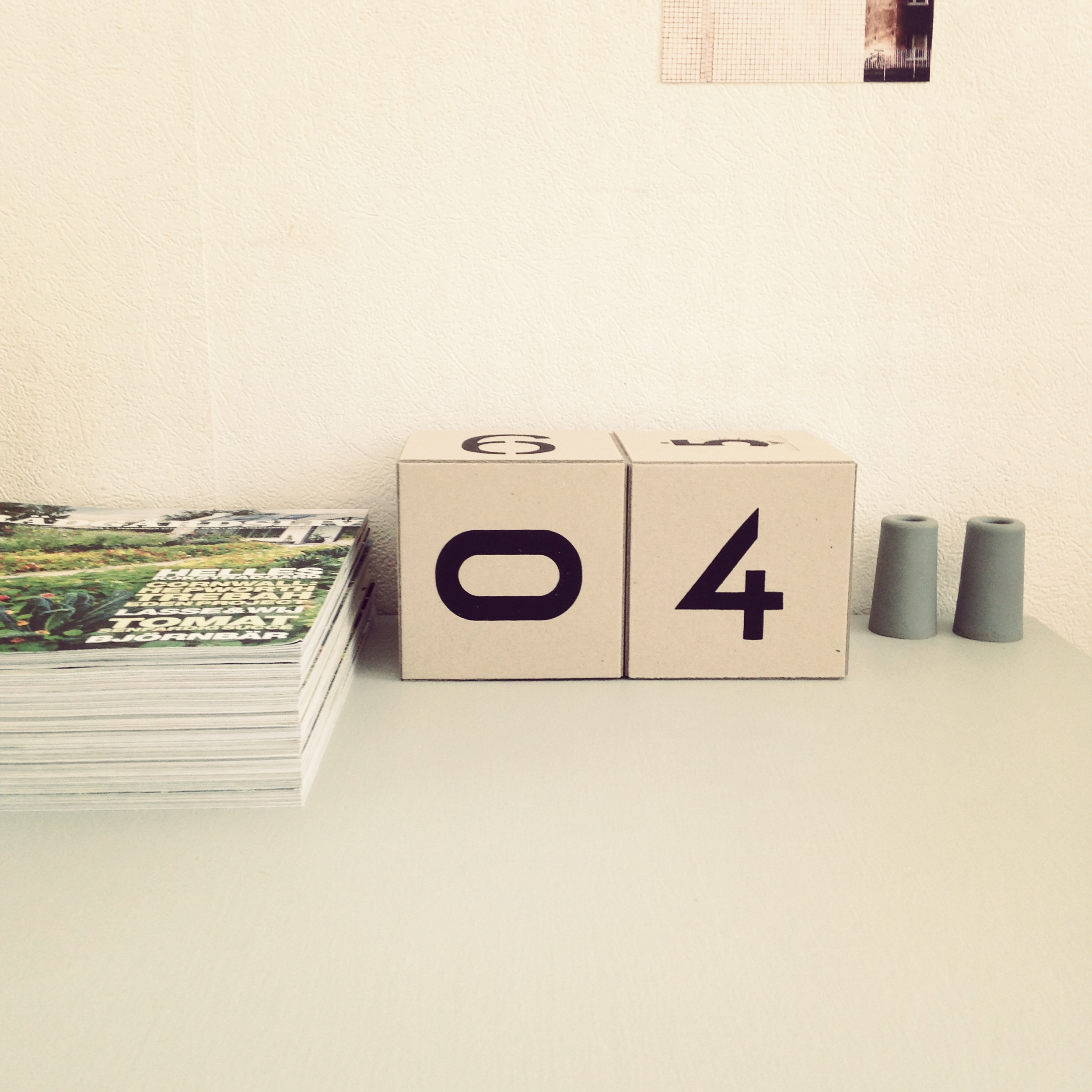
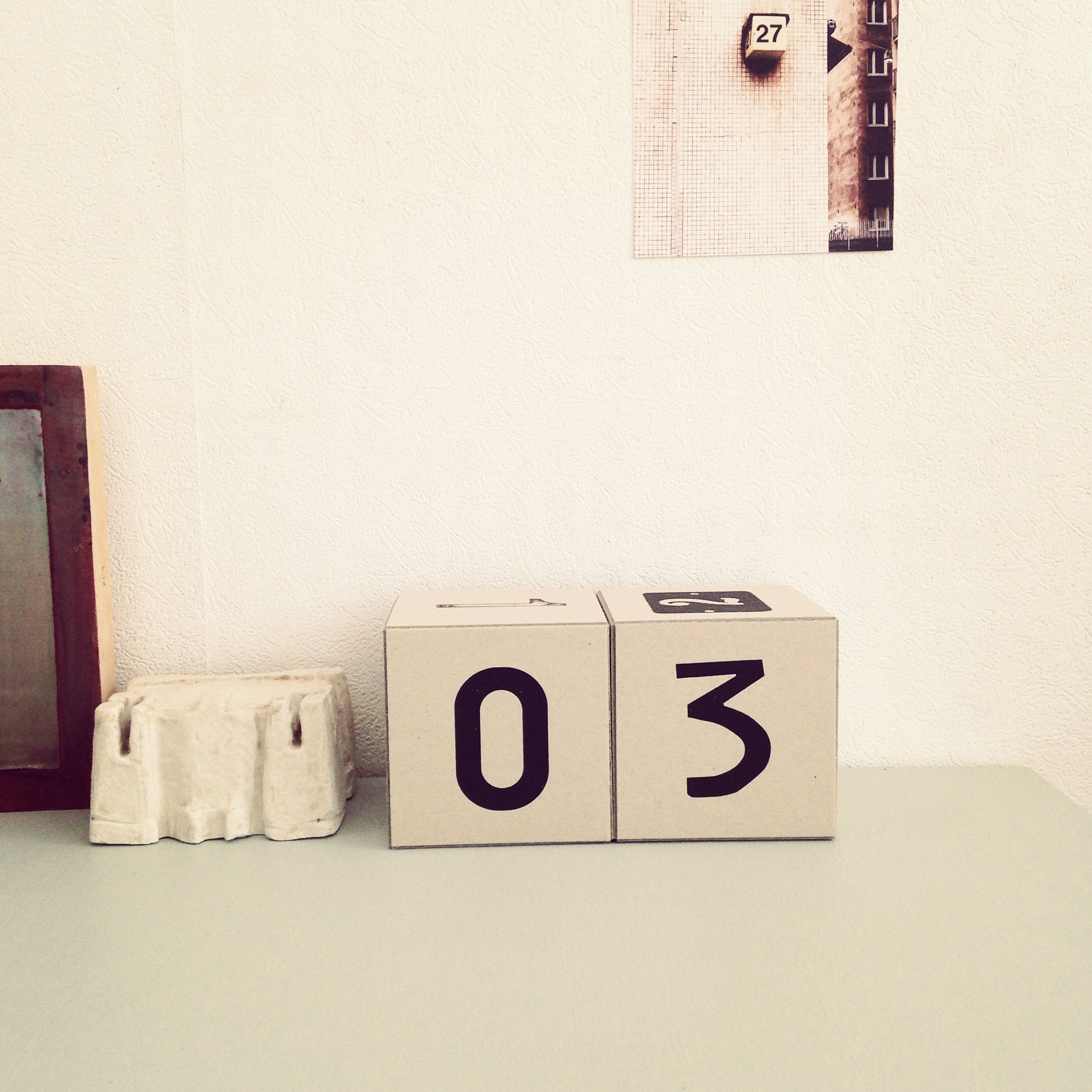
The idea came up for the first time when we biked around looking for numbers for urbnCal 2012 in Helsinki, where many of the street numbers were placed on light cubes. One of the ideas with our wall calendar urbnCal was to make something physical in a digital world. In this calendar we are taking it one step further, the cubes are meant to be handled daily and turned to the current date. Another important part is that you can use it for many years, it’s a sustainable fellow.
12 street numbers screen printed by hand on quality cardboard from Norrmalms Kartongfabrik, glued together in the shape of cubes.
The calendar is inspired by Esa’s mother who every morning grabbed two small wooden cubes and turned to the date, then the weekday and sometimes the month. Our version of the calendar is reduced to just show the date to get a stronger and clearer expression.


When we had printed Världsmästarcykeln and Världsmästarcykeln XL we knew immediately that we wanted to continue to work with the bike theme. We started looking for other models and we have received several suggestions, but we still felt that we were not really finished with Världsmästarcykeln. For us it is somehow the bike. Then came the idea to start print it in color. And we thought, why not try? You are usually able to choose the colour of a bike when you’re in a bike store, so why not fix some new colours on our bike for spring 2014.
We have carefully mixed a colour which we think is near the orange hue we associate with Crescent’s World Championship bike. And we added a bright green and a really dark purple. Colours that are intended to work both together and separately.


When we stood at the printing table, we became so fond of the combination of mint green / purple that we printed a version with both colours, one above the other. So here are the spring colours according jollygoodfellow.


For us a bicycle is the optimal way to get around in a city! You get to know the city in a whole new way, and the city becomes easier to grasp.
The print Världsmästarcykeln!
The idea with this poster is to give the impression of having a real bike on the wall, therefore we wanted to print as close to natural size as possible. Our solution was to split the motif on two 70x100cm sheets.
We wanted to start from a classic racing bike, which for us feels a little like an icon for cycling. By a lucky chance there was a bike exhibition in our hometown of Malmö. We went there on the last day and snapped some pictures for inspiration. Immediately we felt that Harry Snell’s old worn Crescent would be perfect. One of the reasons was that Harry won the amatuer race in Valkenburg 1948 and after that Crescent was branded as the World Champion Bike for years, and the other that it simply had the right feeling.
But the pictures had a noisy background, so we had to spend many hours at the computer to create a nice bike silhouette. It was also the first time we screen printed a large format poster and we made many trials before we got it the way we wanted it. But now both of us absolutely agree that it was worth all the hard work!

The bike can demonstrate an active and healthy lifestyle (or the dream of it) . It can stand for freedom and taking responsibility for our world’s future through a minimal environmental impact.

The photographer and the bike.

There is something very aesthetical with bicycles, graceful and subtle at the same time, and graphical!
——
Update:
Many of you seem to have enjoyed our effort and the edition of Världsmästarcykeln XL is sold out.
We have now a new bike print called Ride, read more about it here or have a look in the jollygood shop!