Smash!
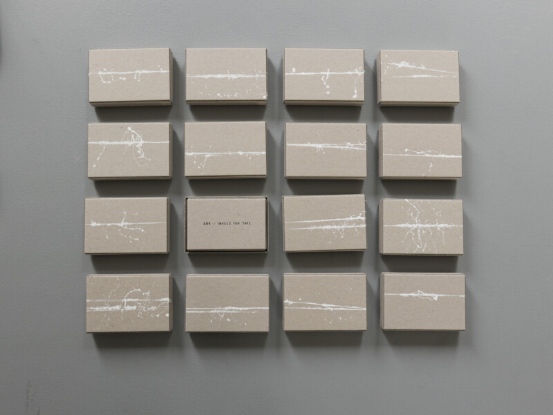
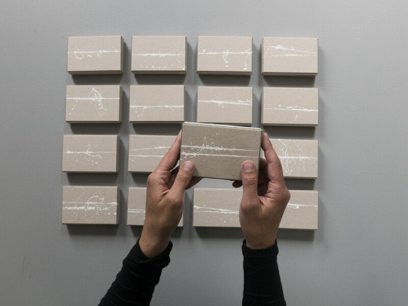
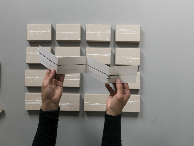
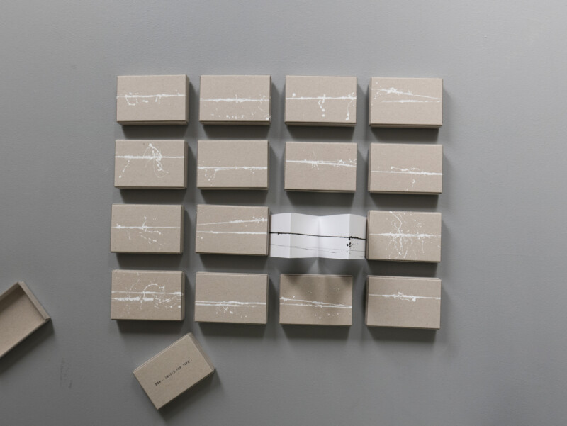
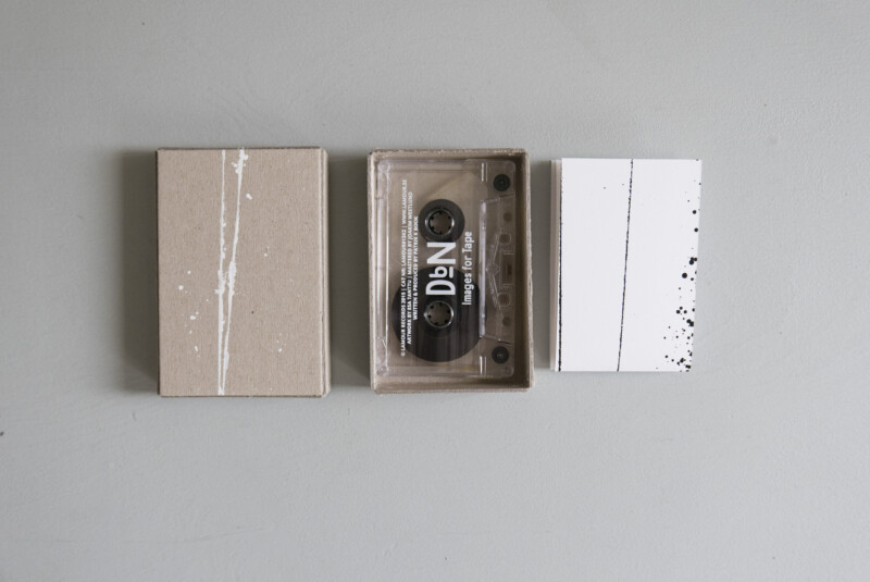
Packaging for Patrik K Book’s project Düsseldorf by Night “Images for Tape”.
You can find more pictures at esa.se
Packaging for Patrik K Book’s project Düsseldorf by Night “Images for Tape”.
You can find more pictures at esa.se
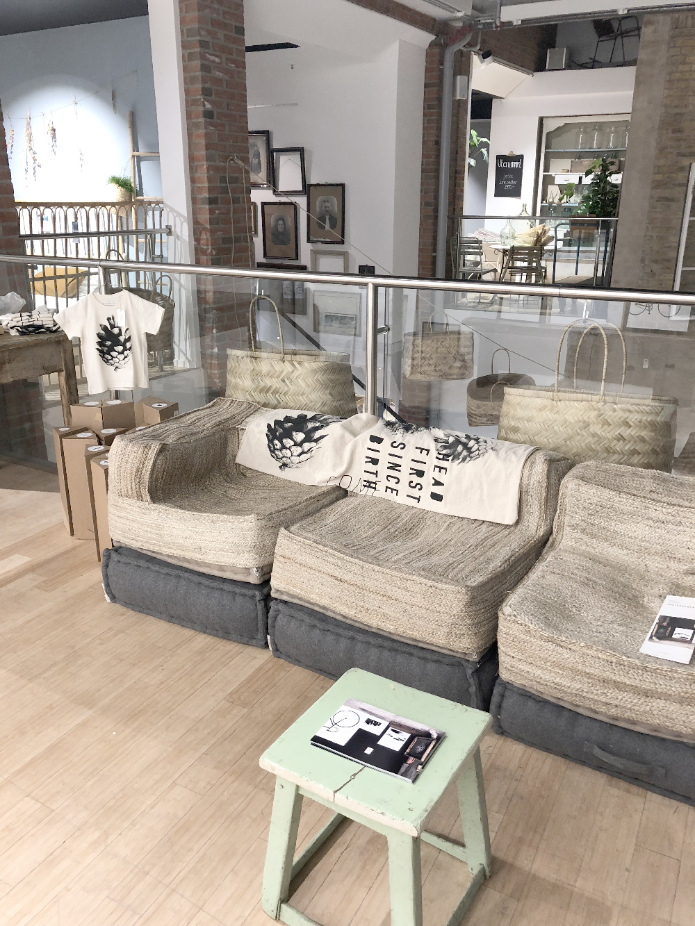
Some years ago we discovered a new store in Malmö. We are not that much into shopping but this place was something more than a place for shopping. Inspiring settings, good coffee, exciting products with high environmental awareness, a place of activity and a place for rest. It’ s called Ab SMÅLAND, we have been back there many times, and now our prints are there all of December, it’s a big honor for us. And yes, they even let us screen print on the wall ; )
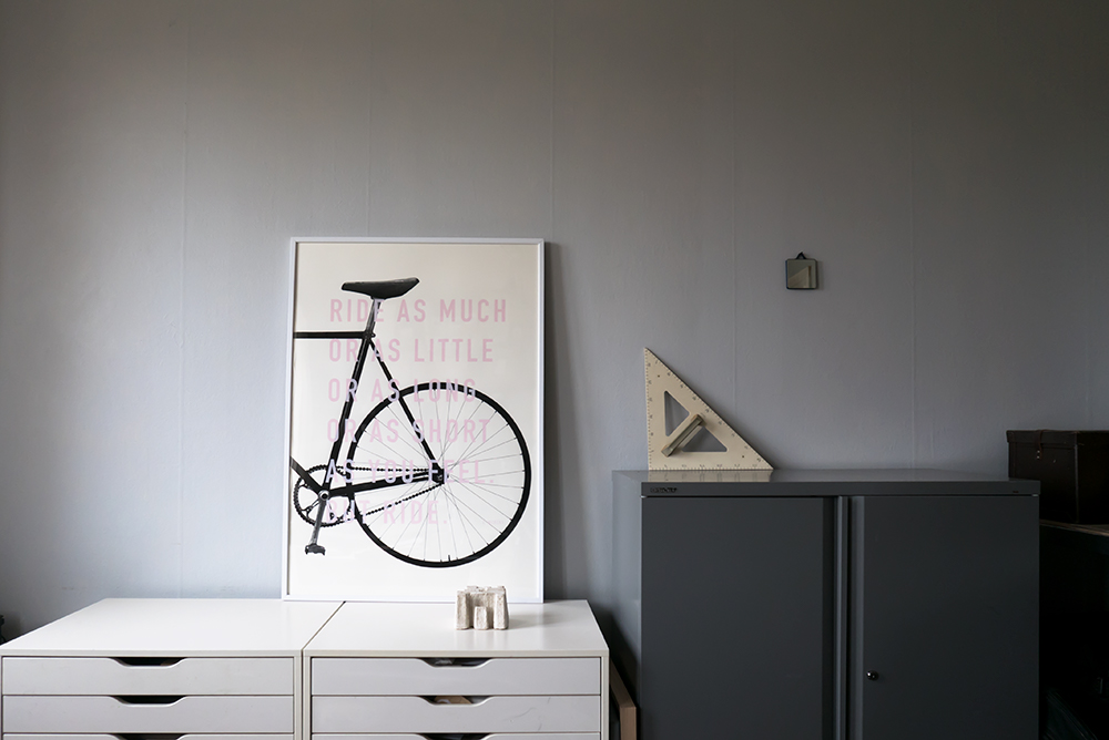
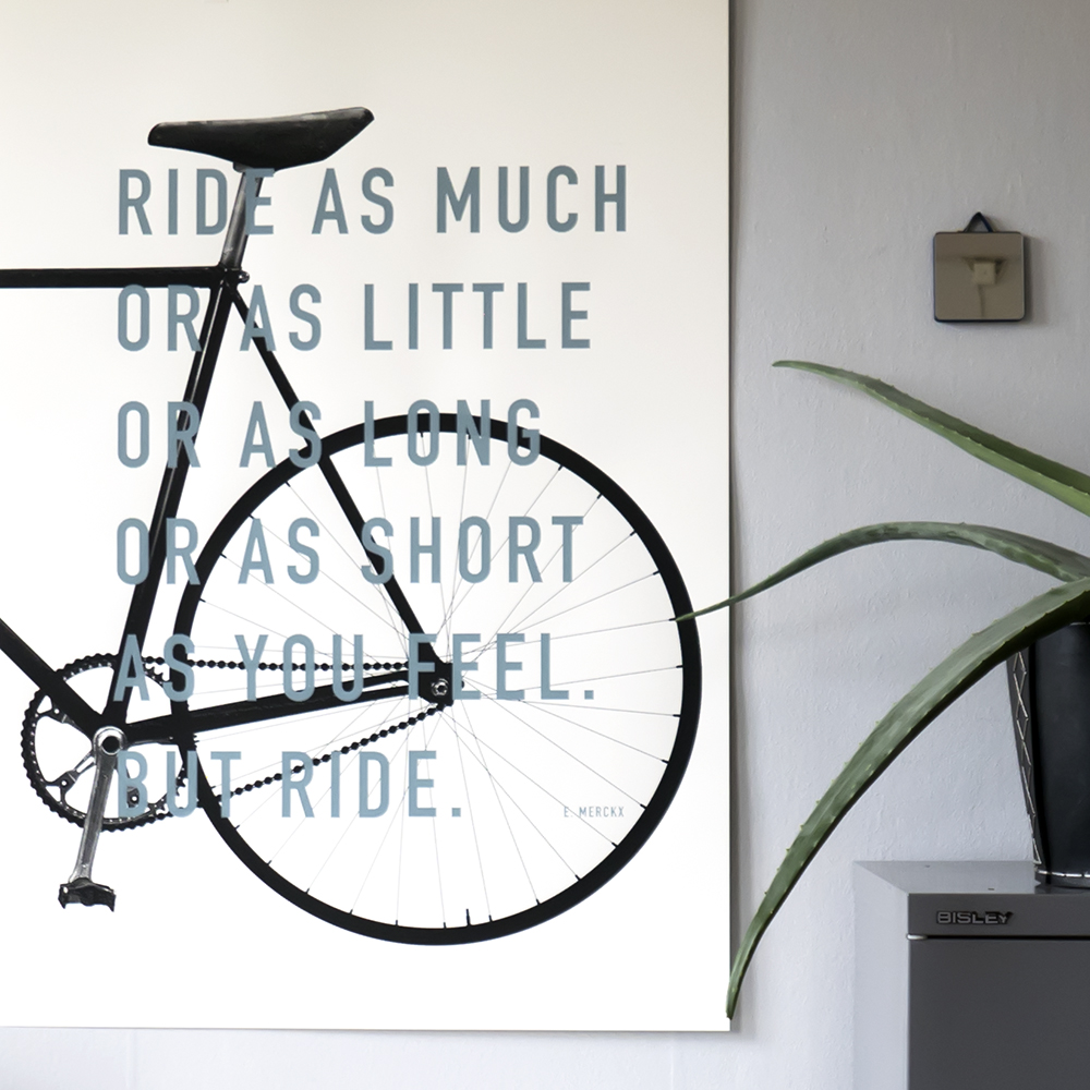
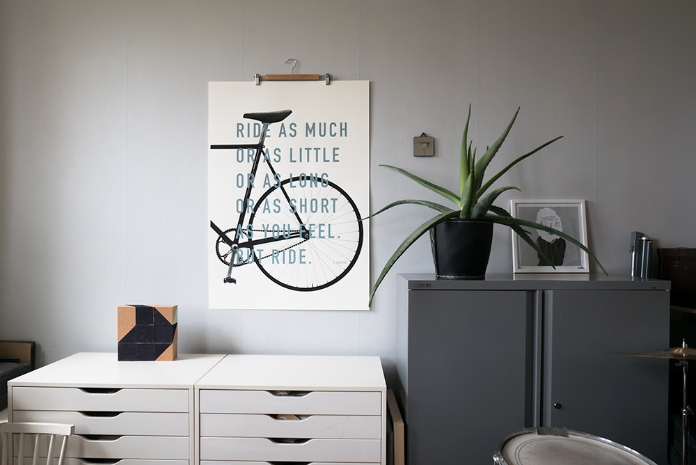
As a little spinoff from the “Unique Fellow project” we have printed our favorite quote from Eddie Merckx in color on top of one half of the Ride XL print. We started with soft pink and then a grayish blue. We have decided to print them in very small editions (max 10 per color) as a way to keep them almost as unique as the Unique Fellows. And who knows maybe we mix and print some more colors further on. You can find these tow in the shop.
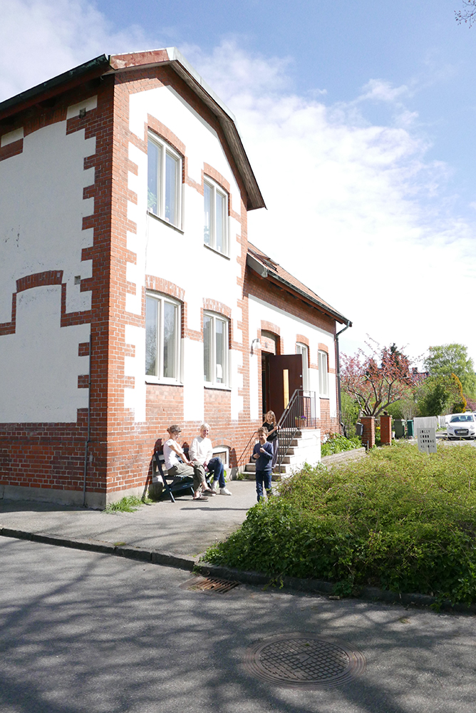
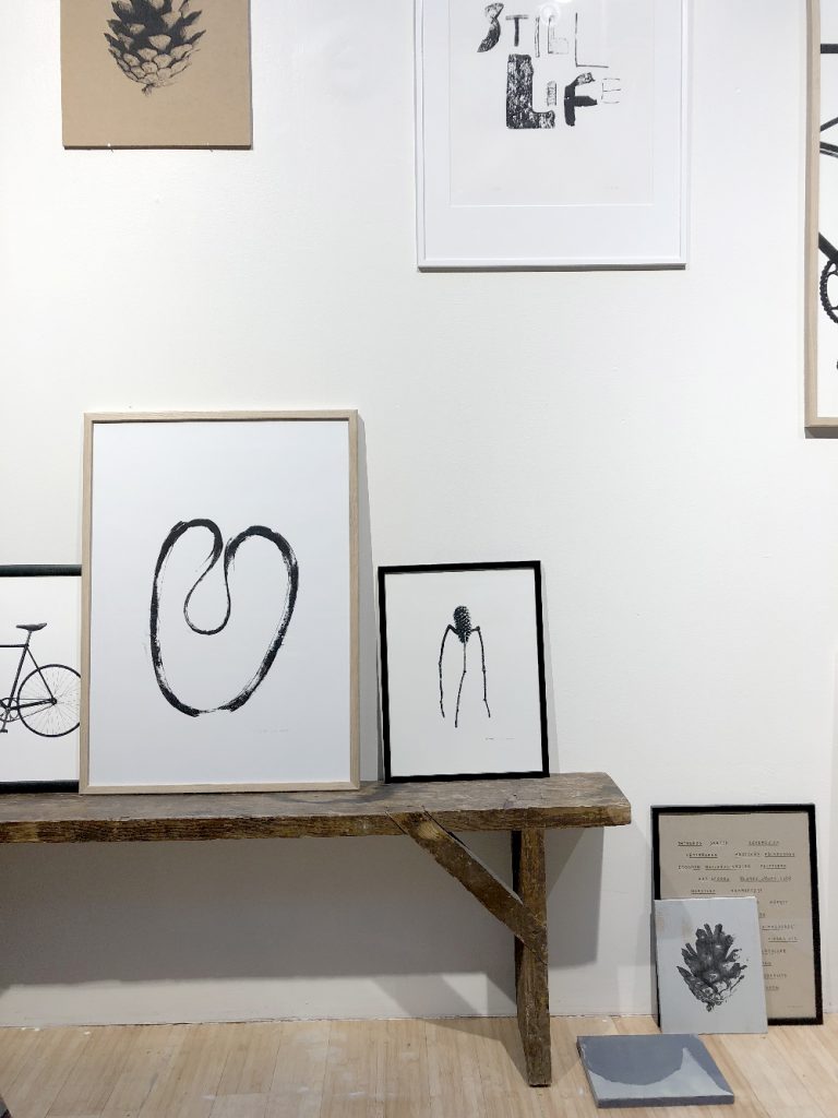
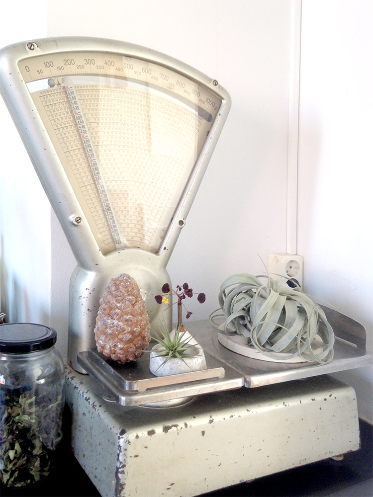
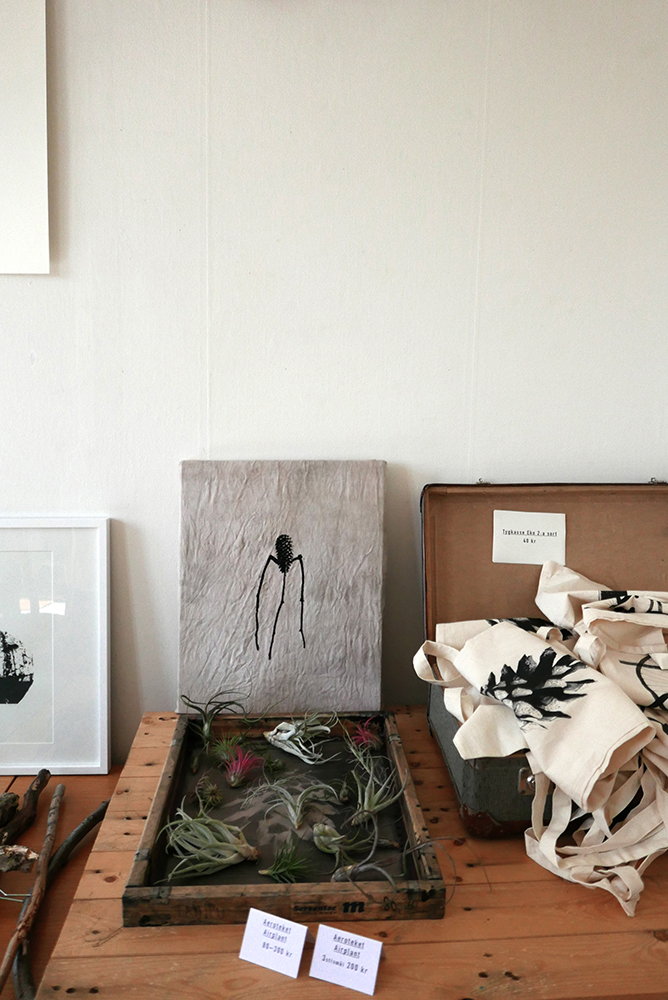
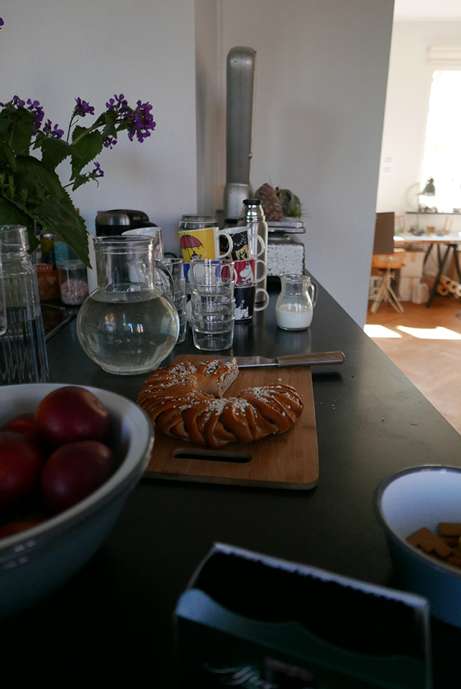
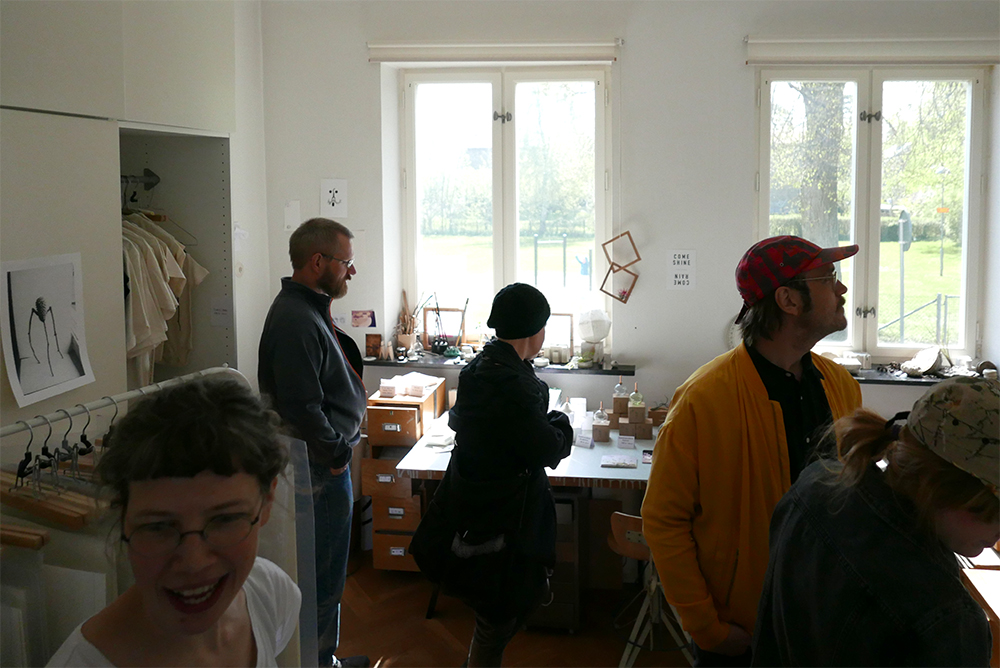
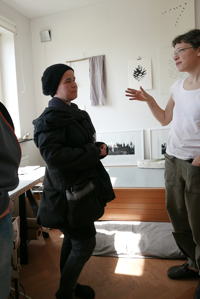
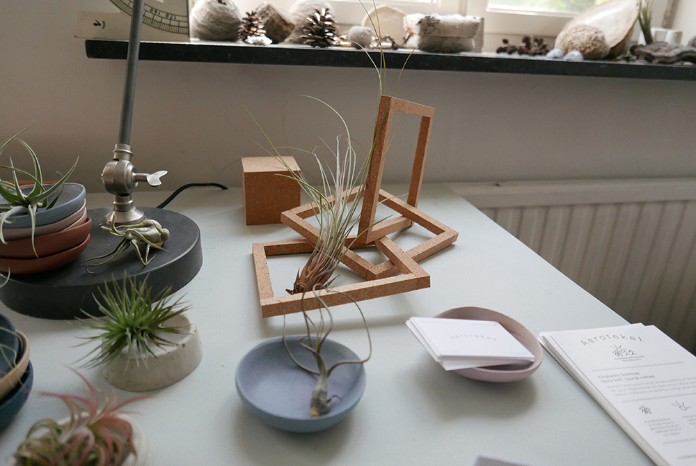
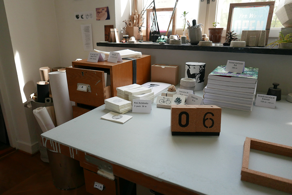
Sunshine, books, vases, airplants, natural dyed textiles and a lot of prints! It was a very nice #jollygoodlördag and here are some pictures for you that live too far away to come by in person ; )
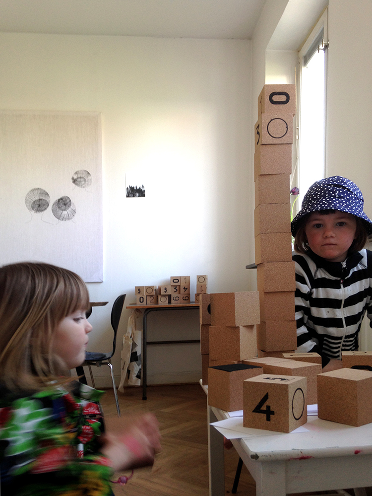
We served the kids with a lots of cork cubes to build and play with.
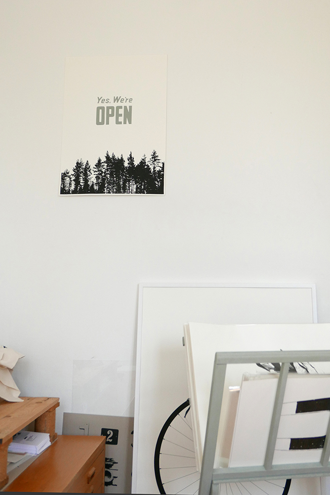
The print we call Allemansrätten on the wall. Yes we´re open!
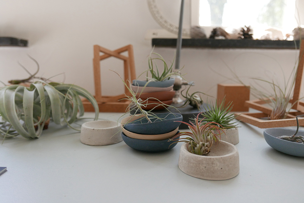
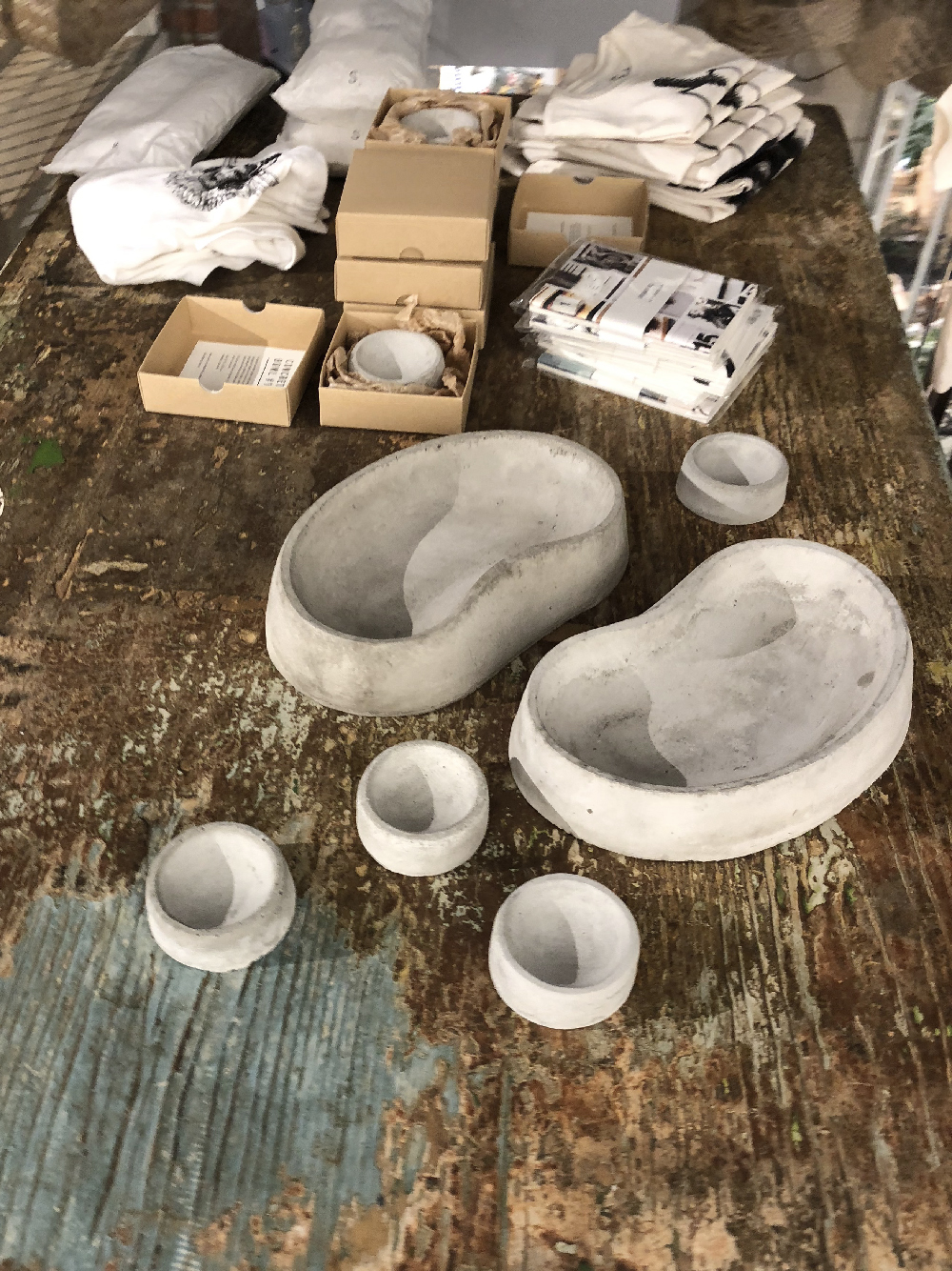
Aeroteket brought a lot of nice airplants and ceramic bowls that are a perfect match with our Concrete Bowl #1 :-).
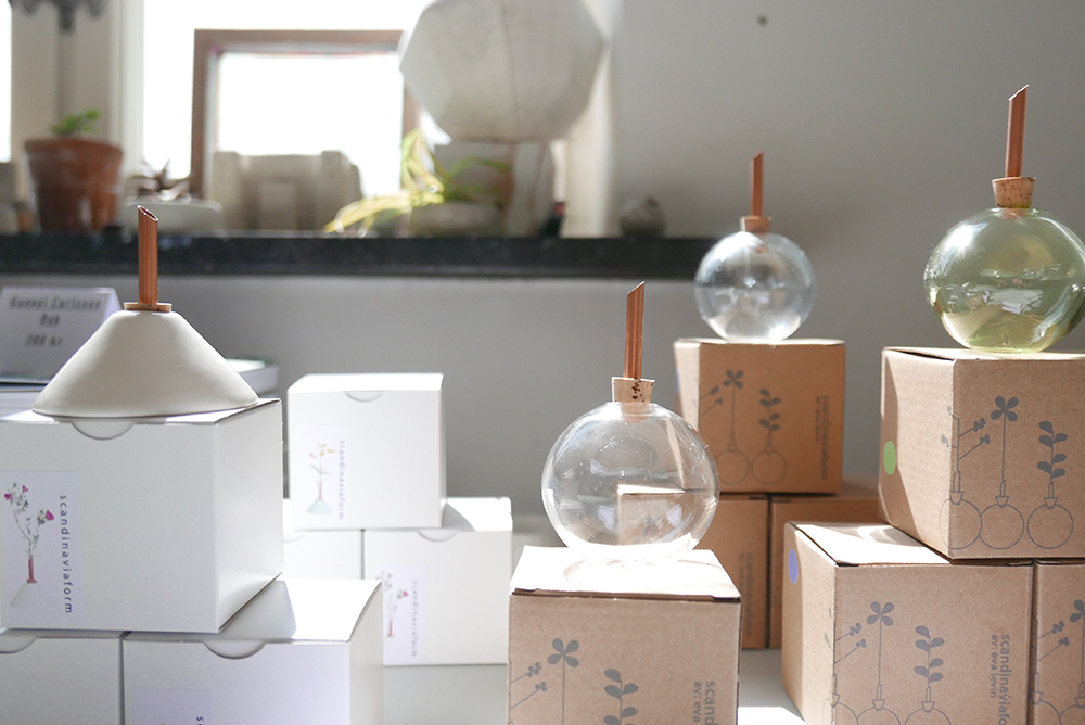
Scandinaviaform‘s vases look great even without flowers in them!
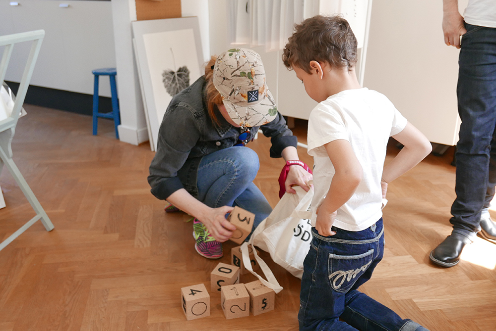
Slightly imperfect cork cubes from our Urban Cube Calendar are recycled as toys.
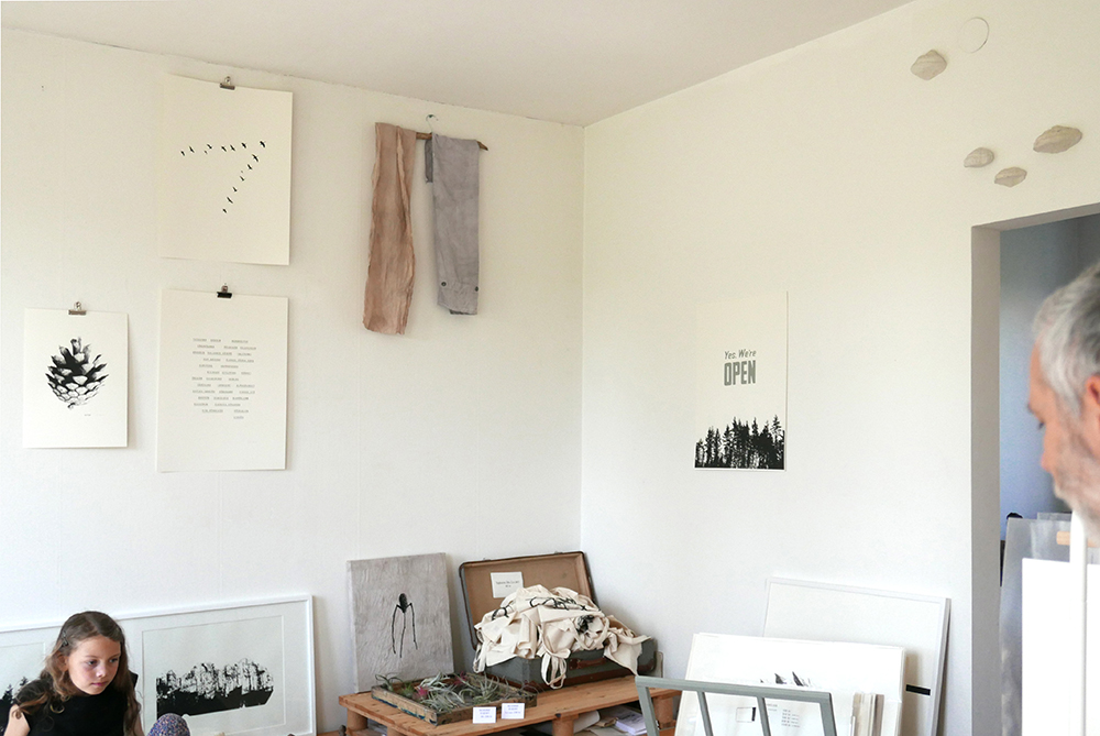
Premiere for our natural dyed textile on wall.
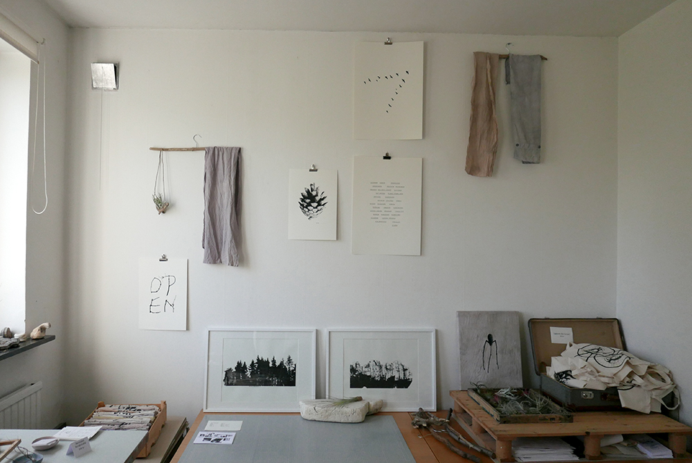
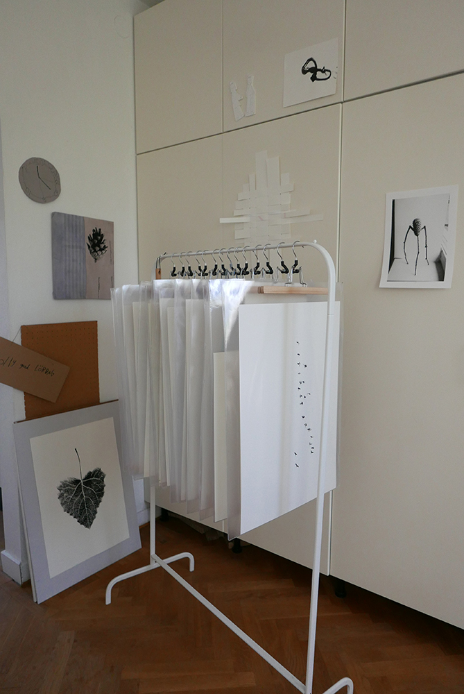
A rack full of Unique fellows!
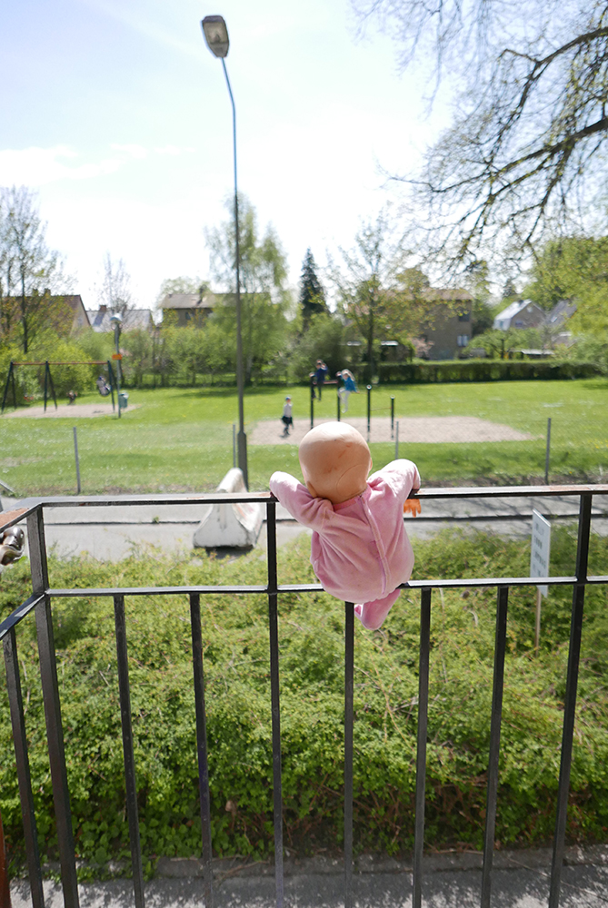
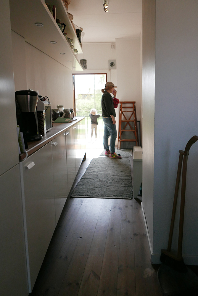
Action in the playground in front of the house.
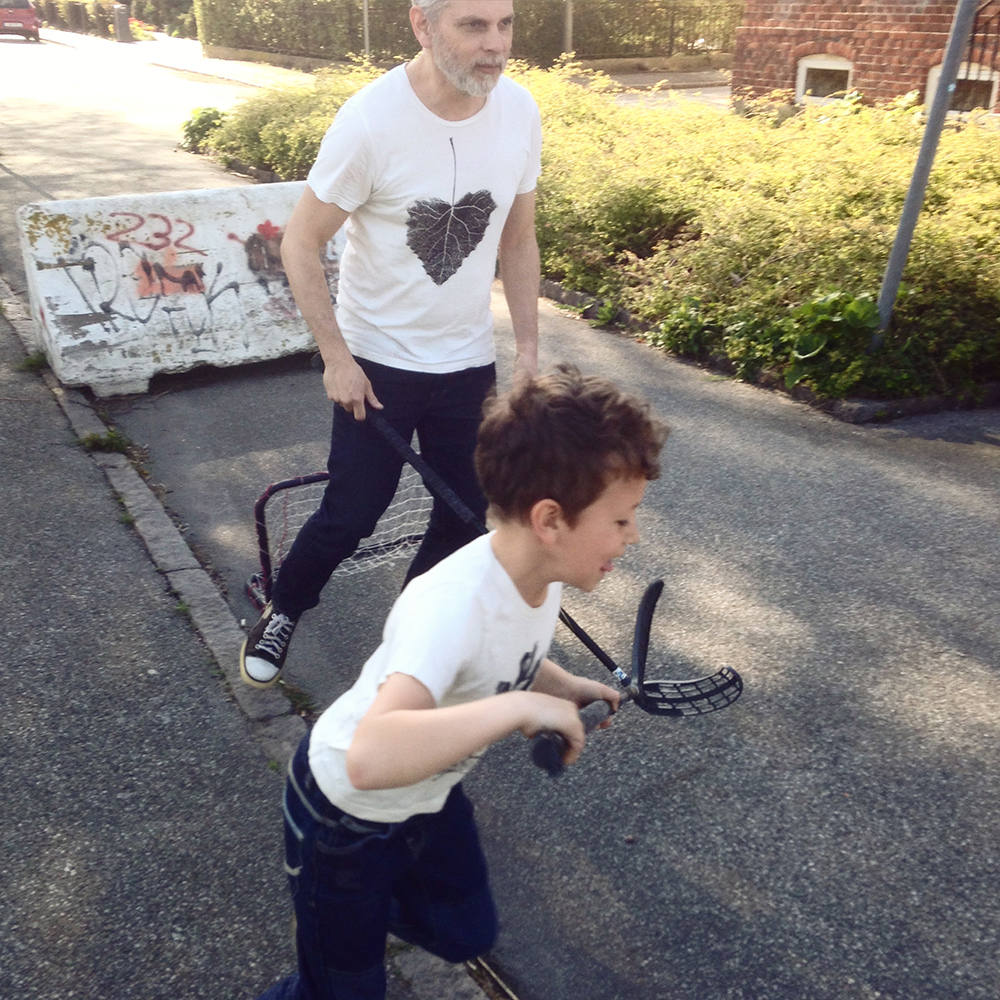
After work – play!
As we love paper and specially Munken, that we use for most of our screenprints, it’s a big honor for us that Arctic Paper wanted to interview us and feature us in their series Paper Passion.
Interview with Esa and Lisa Tanttu
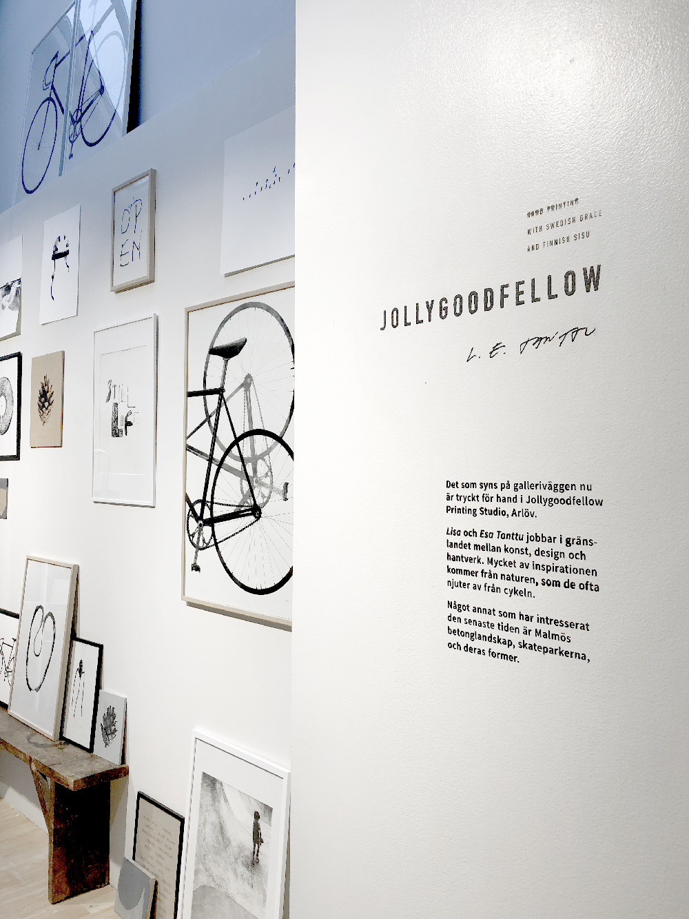
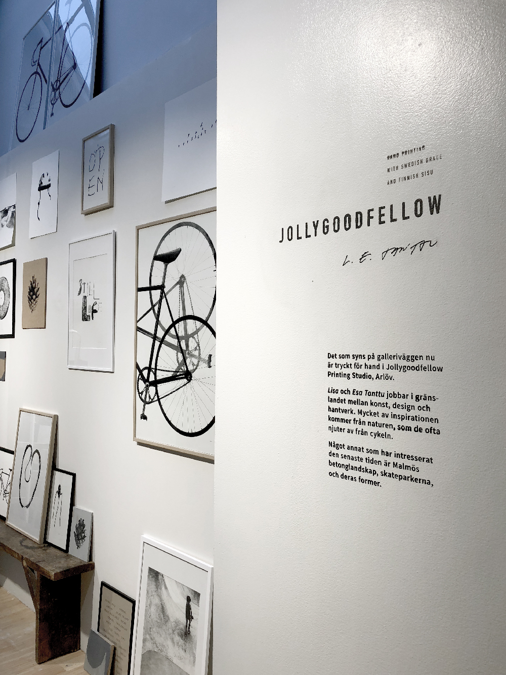
The creative agency Jollygoodfellow is run by spouses Esa and Lisa Tanttu. Together, they create everything, from brainstorming and sketching, to actually pressing motives of screen prints in their own workshop. In just a few years, they have gone from easygoing hobbyists to selling their handicrafts on an international market.
When Esa and Lisa met in a Stockholm rock club in the early 2000s, they never thought that, one day, they would make handcrafted products together. Today, under the name Jollygoodfellow, they run a creative agency and sell products through nearly 30 retailers from Tokyo to New York. When they met, Lisa studied arts and crafts at Österlenskolan, and had thoughts about becoming a volunteer abroad, and Esa worked as a graphic designer at an agency in Stockholm. But something drew them together, and already after a second date they discovered that they shared a common interest; handcrafting.
– We tried out screen printing together the second time we met, which was extremely fun. It became a part of our relationship from that moment on, says Lisa Tanttu.
After a few years together in Stockholm, the couple moved to Malmö, in South of Sweden, to continue working on their hobby. At the same time, Lisa, who was a recent graduate from Konstfack University of Art, Crafts and Design, worked as an art teacher and Esa freelanced with various projects. The name of the agency, Jollygoodfellow, was thought of during a time when skulls and “cool stuff” was seeing popularity, whereupon Esa and Lisa wanted to stand out and instead have something witty or almost silly.
– One might think of the birthday song at first, but the name also has a double message, just like all of our motives. We make sure that everything we produce is made of carefully selected materials, and therefore we see the products as “good fellows”, says Esa Tanttu.
The motives, which Esa and Lisa screen print on posters mostly, but also on t-shirts, bodysuits and bags, they make themselves. They can be based on photographs, which later are processed digitally, but also sketched freehandedly. Esa and Lisa always strive to make simple, everyday motives, which also can be ambiguous and have an underlying political message.
– The bikes, which are our most popular motives, we developed to celebrate the bicycle as transportation. Another example, is an image of a forest with the text “we’re open”, which we produced to celebrate the Swedish legal right of access to private land, a fantastic legal right that many people tend to forget, says Lisa.

Lisa and Esa Tanttu in their studio. Behind them several of their well known motives. Photo by: Daniel Ekbladh.

Lisa in their studio, cutting some of the posters. Photo by: Daniel Ekbladh

Esa and Lisa working from home, in their own workshop. Photo by: Daniel Ekbladh.

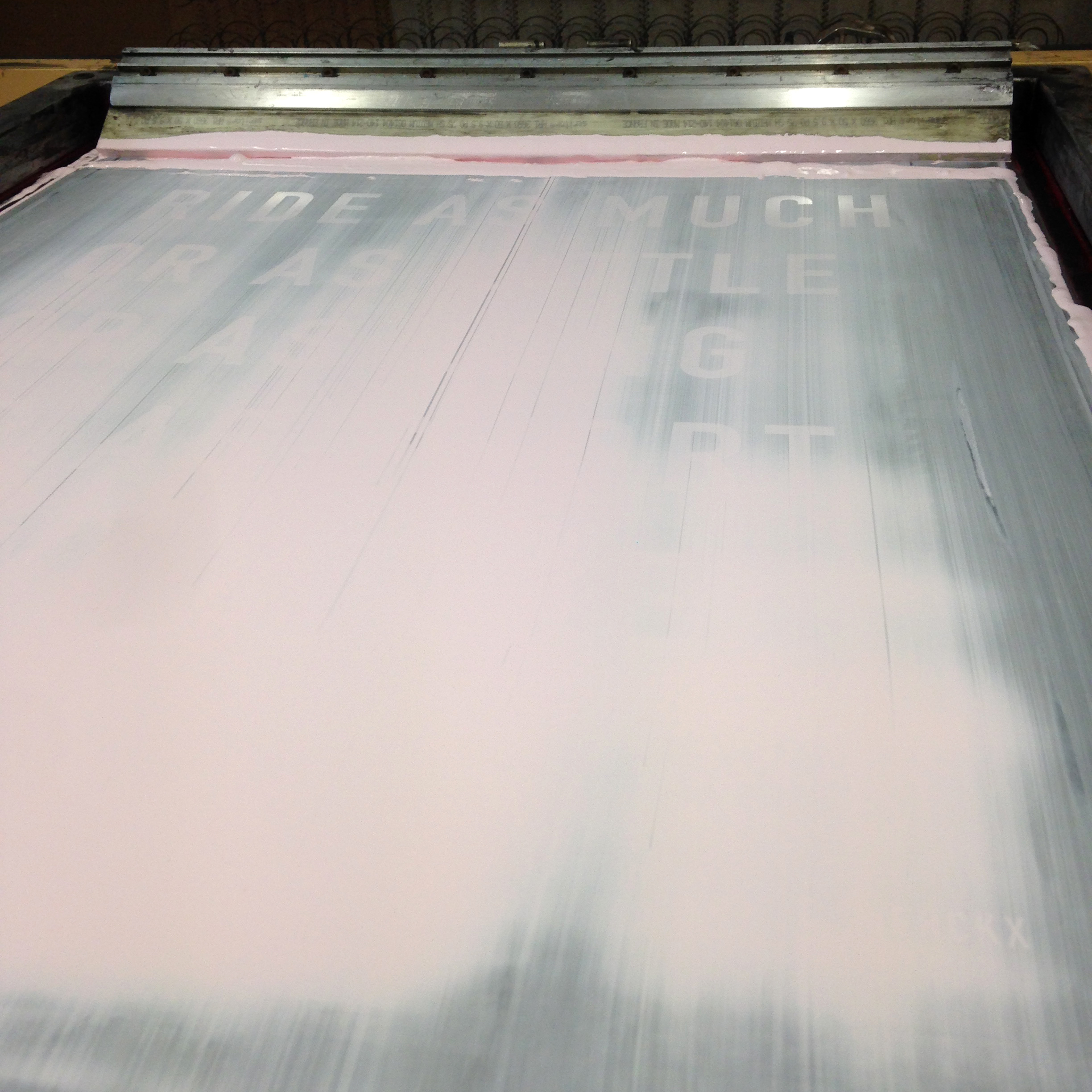
The screen printer Jollygoodfellow uses for making their beautiful poster. Photo by: Daniel Ekbladh.

One of Jollygoodfellows famous bike prints. Photo by: Daniel Ekbladh.
It’s very important for Esa and Lisa that all material they use is produced in an environmentally friendly way, and if possible, manufactured in Sweden. The color they use to print with is made on the island Gotland, and the paper they use for the posters are produced in Munkedal on the Swedish west coast. In addition, they also ensure that they use as much of the leftover material as possible, which sometimes becomes exciting combinations that they sell on the website as specials, under the category “Unique Fellows”.
– The prints can become slightly different from time to time, even if the point of screen printing is to make many identical prints, then we sell them as specials instead of throwing them away. We recycle sample prints, we save waste materials and make covers for notebooks, for example. We have also tried to braid strips from when we cut posters. We try to re-use as much material as possible, says Esa.
Now, Jollygoodfellow have been around for almost ten years, and much has happened since the beginning. They have gone from selling bags at Christmas markets to selling hundreds of posters through a number of retailers around the world. Esa and Lisa believe that they live in their dream project, and that the attention they get from customers is incredible. They also appreciate that they get to work with materials and techniques they feel passionate about.
– Paper has always been a big part of our work, and I’m particularly fond of uncoated paper. We use it every day in our creative process and it’s extremely important for the final outcome of the work, says Esa.
Being on the fine line between art and commercial products is nothing Esa and Lisa see as negative, however, it can be difficult in certain projects. In one of their largest projects, the “Urban Calendar”, where they made calendars with photos of different door numbers in Copenhagen, Helsinki and Stockholm, that particular issue became very prevalent.
– Some people thought there wasn’t enough space to write stuff down in the calendar. It was perhaps a little too artistic. It was a bit frustrating, but at the same time we like to push the boundaries, says Lisa.

One of Jollygoodfellow’s largest project, the ”Urban Calendar”. This one is from Helsinki. Photo by: Jollygoodfellow

The print that celebrates the Swedish legal right of access to private land. Photo by: Jollygoodfellow

One of the walls in the studio, a poster with three of Jollygoodfellows most famous motives, the bike, the forest and the cone. Photo by: Daniel Ekbladh

Finished posters put out to dry. Photo by: Daniel Ekbladh

A sample print that became a so called ”Unique Fellow”. Photo by: Jollygoodfellow
FACTS
Name: Esa and Lisa Tanttu (aka Jollygoodfellow)
Title: Creators
Favorite material: Uncoated paper
Favorite tool: For Esa it’s a pen and for Lisa it’s a knife.
You can find more “paper interviewes” on the blog Paper Passion by Arctic Paper, have a look!

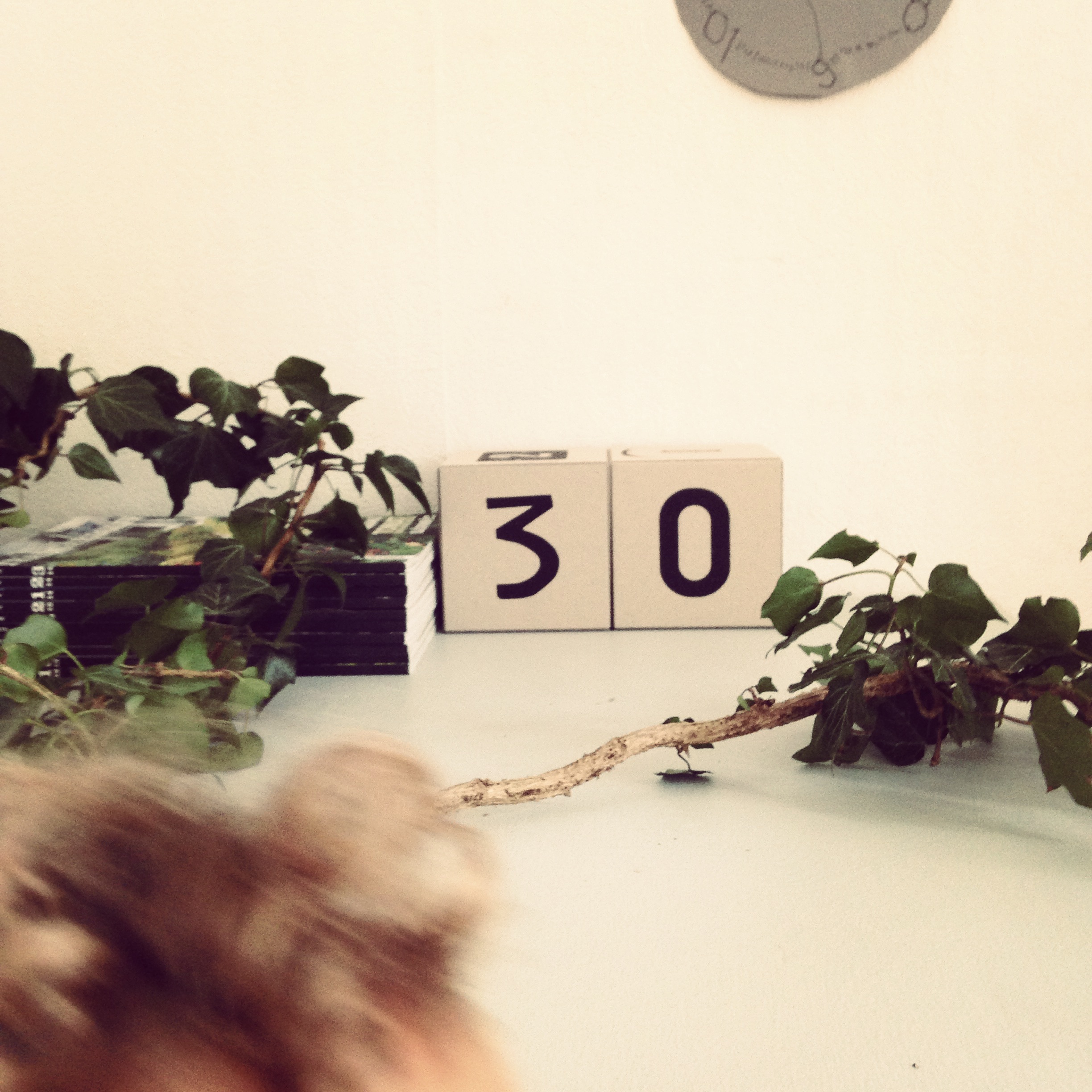
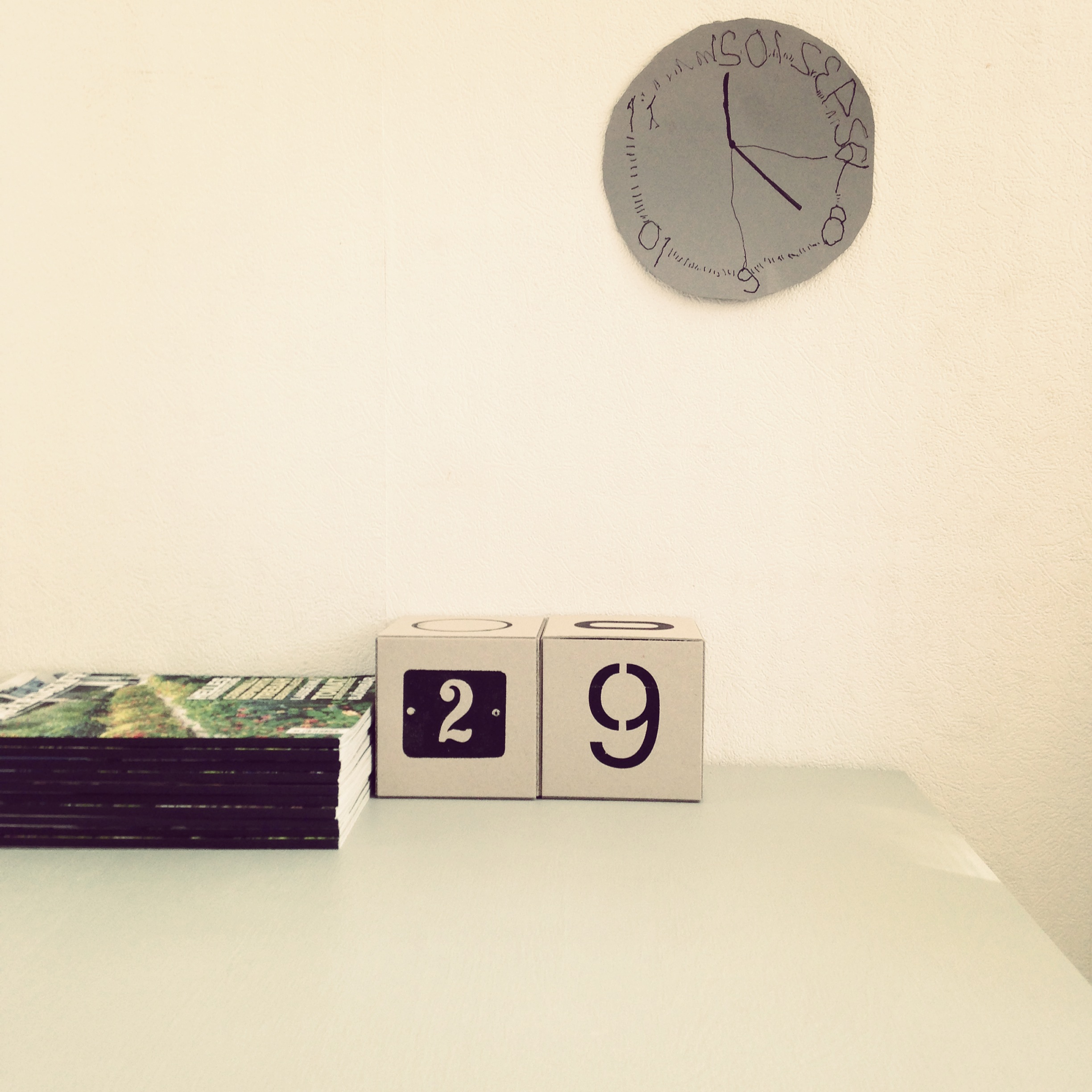
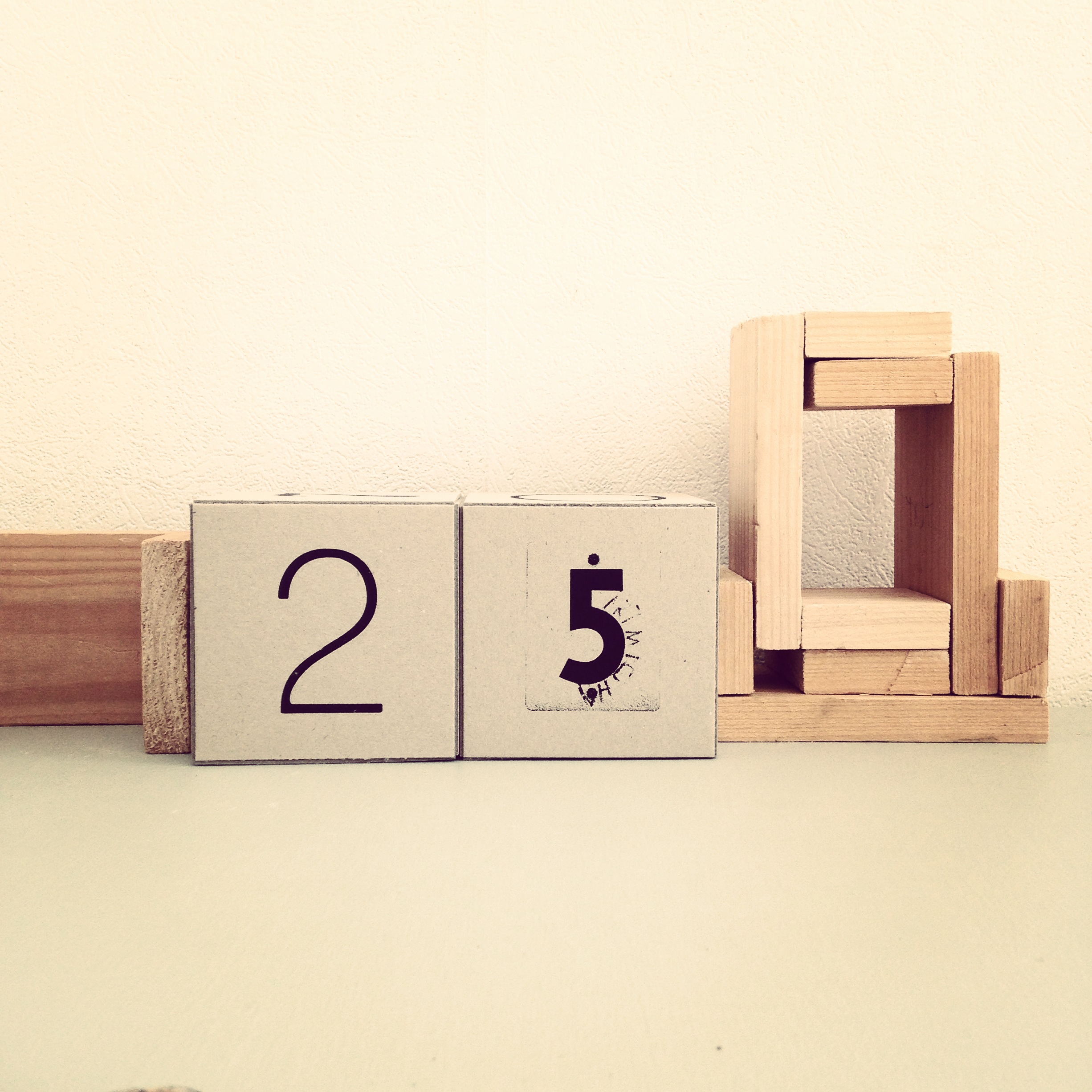
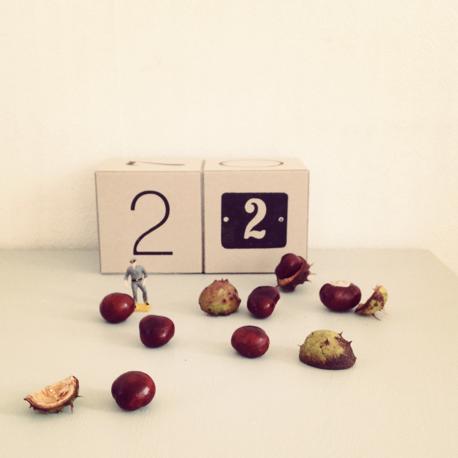
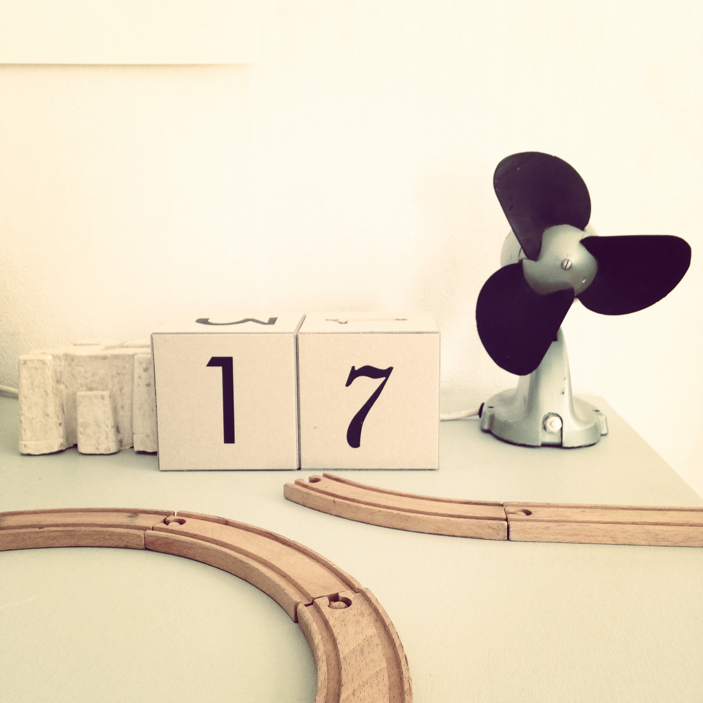
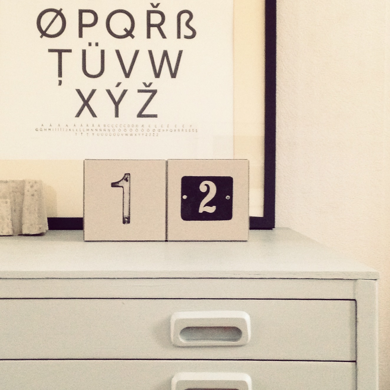
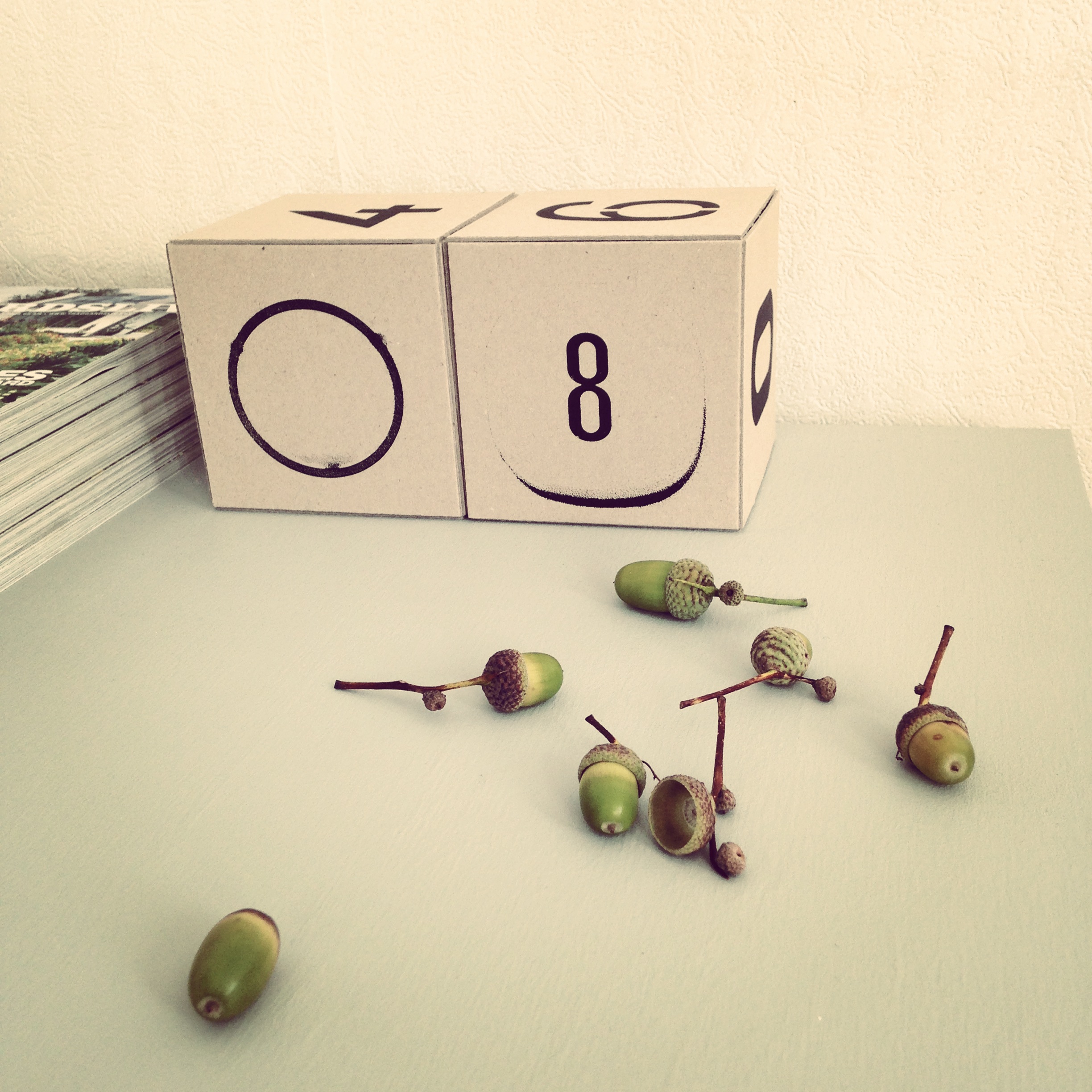
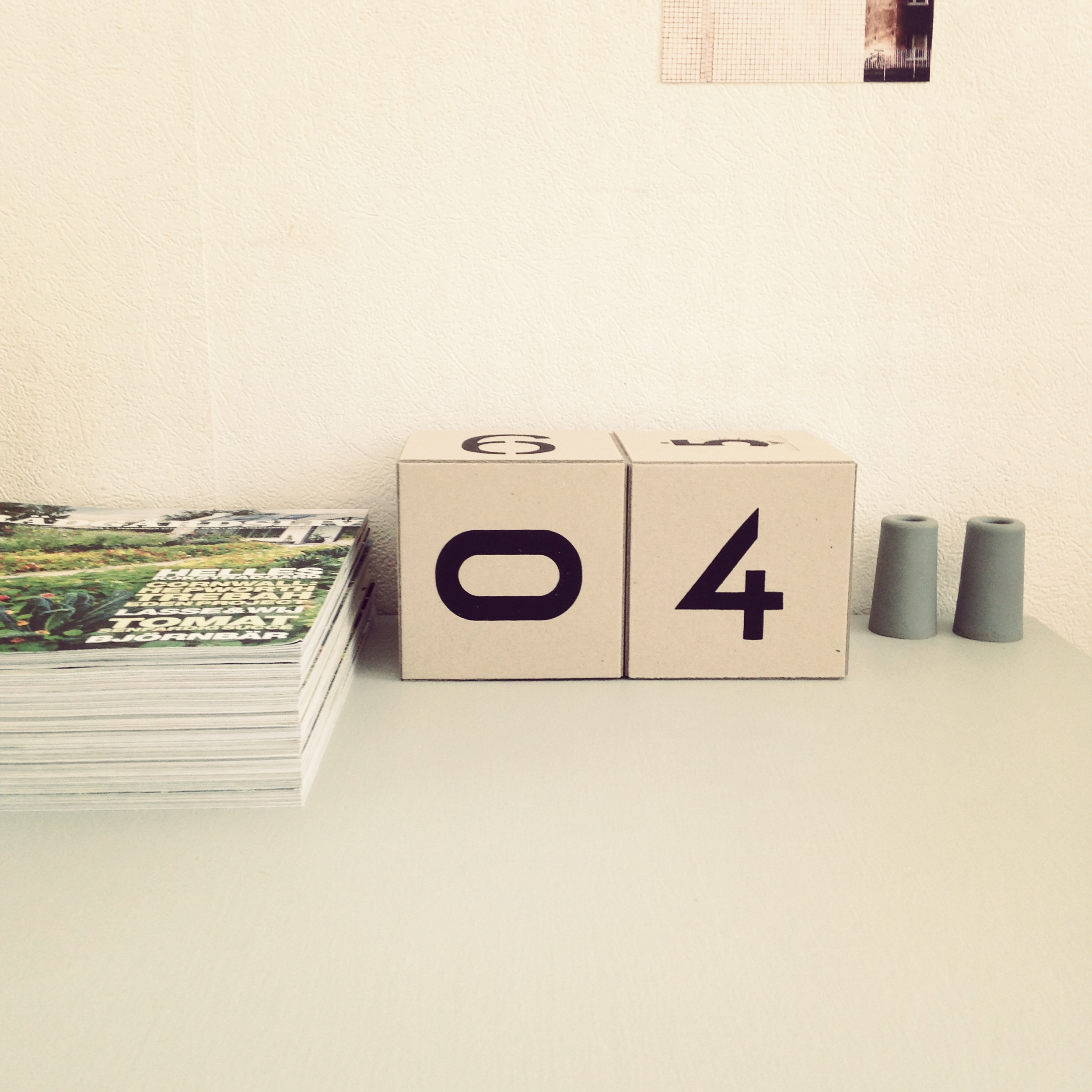
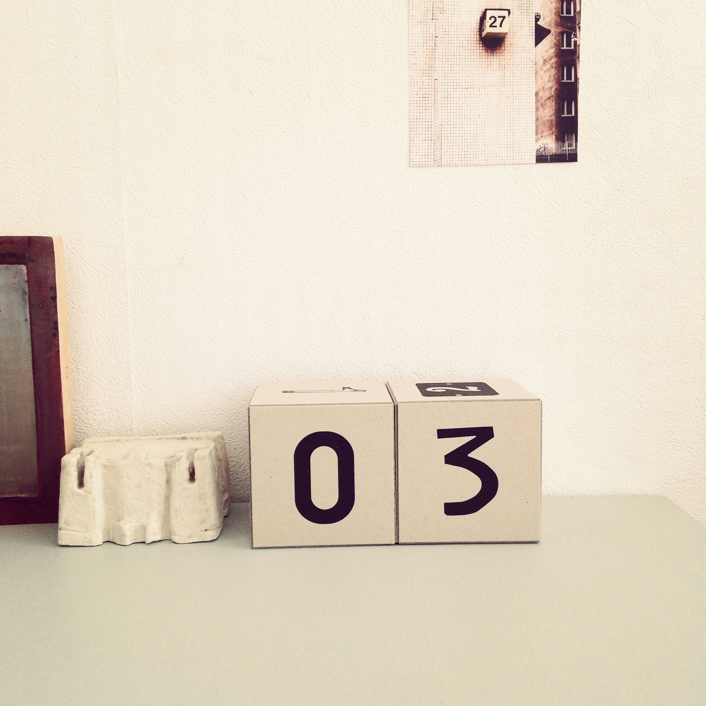
The idea came up for the first time when we biked around looking for numbers for urbnCal 2012 in Helsinki, where many of the street numbers were placed on light cubes. One of the ideas with our wall calendar urbnCal was to make something physical in a digital world. In this calendar we are taking it one step further, the cubes are meant to be handled daily and turned to the current date. Another important part is that you can use it for many years, it’s a sustainable fellow.
12 street numbers screen printed by hand on quality cardboard from Norrmalms Kartongfabrik, glued together in the shape of cubes.
The calendar is inspired by Esa’s mother who every morning grabbed two small wooden cubes and turned to the date, then the weekday and sometimes the month. Our version of the calendar is reduced to just show the date to get a stronger and clearer expression.

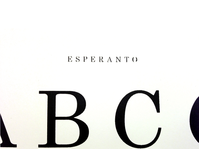
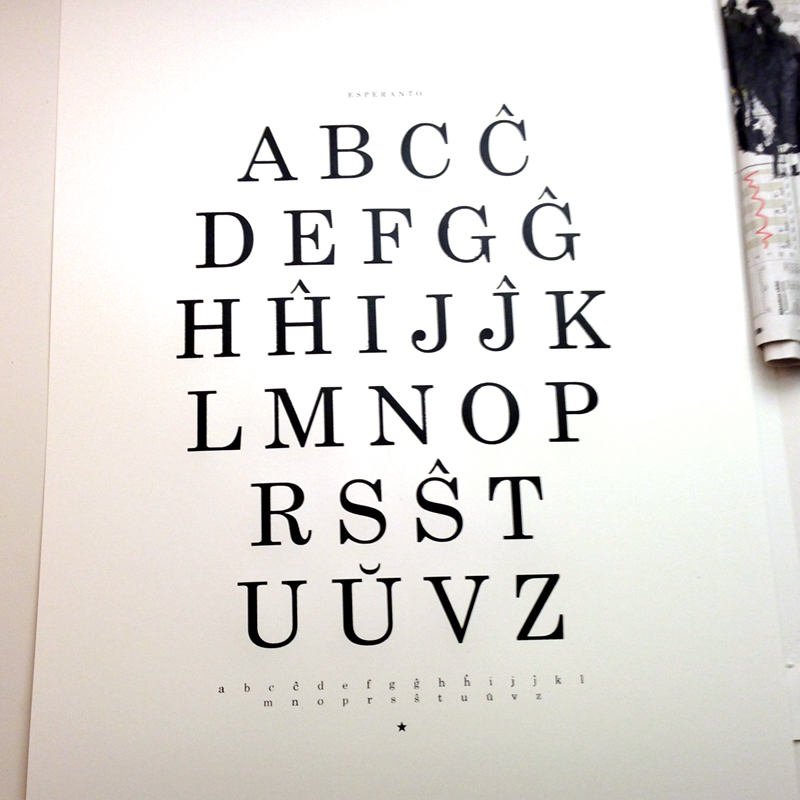
Ĉu vi parolas Esperanton? (Do you speak Esperanto?)
It’s really fascinating this ambitious idea to create a new language to foster harmony between people. Esperanto is, after 125 years, still spoken, but I guess English is hard to compete with (which we also use on this web site). If it wasn’t for M. A. Numminen we might not have thought about it that much. But a language he knows and even sings in must be worth a hand silkscreened poster!
Esperanto is the most widely spoken constructed international auxiliary language. Its name derives from Doktoro Esperanto (“Esperanto” translates as “one who hopes”), the pseudonym under which L. L. Zamenhof published the first book detailing Esperanto, the Unua Libro, on July 26, 1887. Zamenhof’s goal was to create an easy-to-learn and politically neutral language that transcends nationality and would foster peace and international understanding between people with different regional and/or national languages.
This poster is part of a series we are working on that explores the graphic expression of languages (and the relationships between people) with the starting point in Sweden, where we live.
See also ABÇ-plansch.

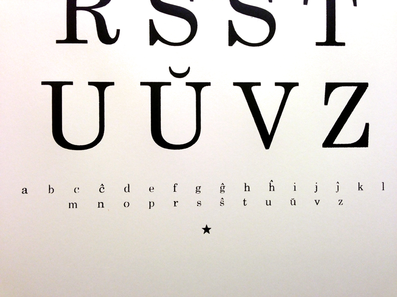
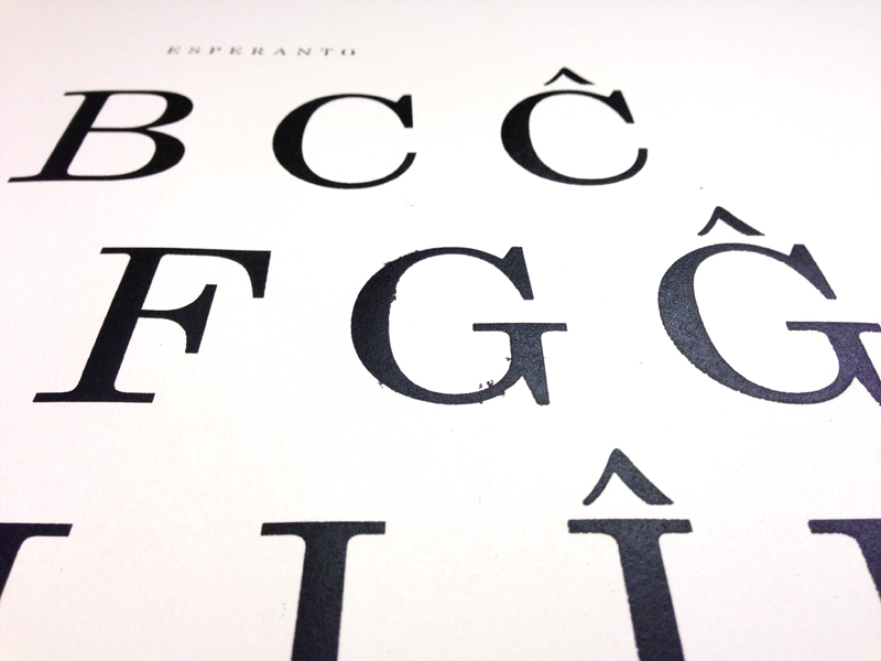
For us it has been a lot of numbers in recent years, so now it’s time for some characters.
The inspiration for this print comes from our new hometown Malmö (in the southern part of Sweden). A city where about 50% of the population has other native languages than Swedish. The ABÇ-plansch, an extended abc-poster, is our way of celebrating the great variety of expressions and a chance for us to enjoy exiting graphic shapes.
The selection is based on form and we have focused on the Latin alphabet and languages found in Europe. After some research we had an overwhelming amount of characters, to get the abc-feeling we kept 26 at a large size and placed the rest in three lines at the bottom of the print.


We think this print fits in a kids room (since today’s gifted kids already know how to read before they start kindergarten 😉 or to anyone who enjoy a graphic look.
Paper: Munken Pure 240g
Edition: Numbered 200
Print: Screen printed by hand
Typeface: Museo Sans
Design: L. E. Tanttu – jollygoodfellow, Sweden
Available at Supermarket and Nordic Design Collective.