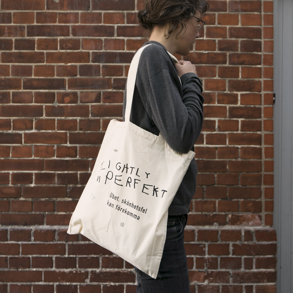
Have you seen our catalog?
We made a new catalog earlier this fall. Here are some of the pictures we shot for it. Hope you like them! And to see the full catalog, follow this link.
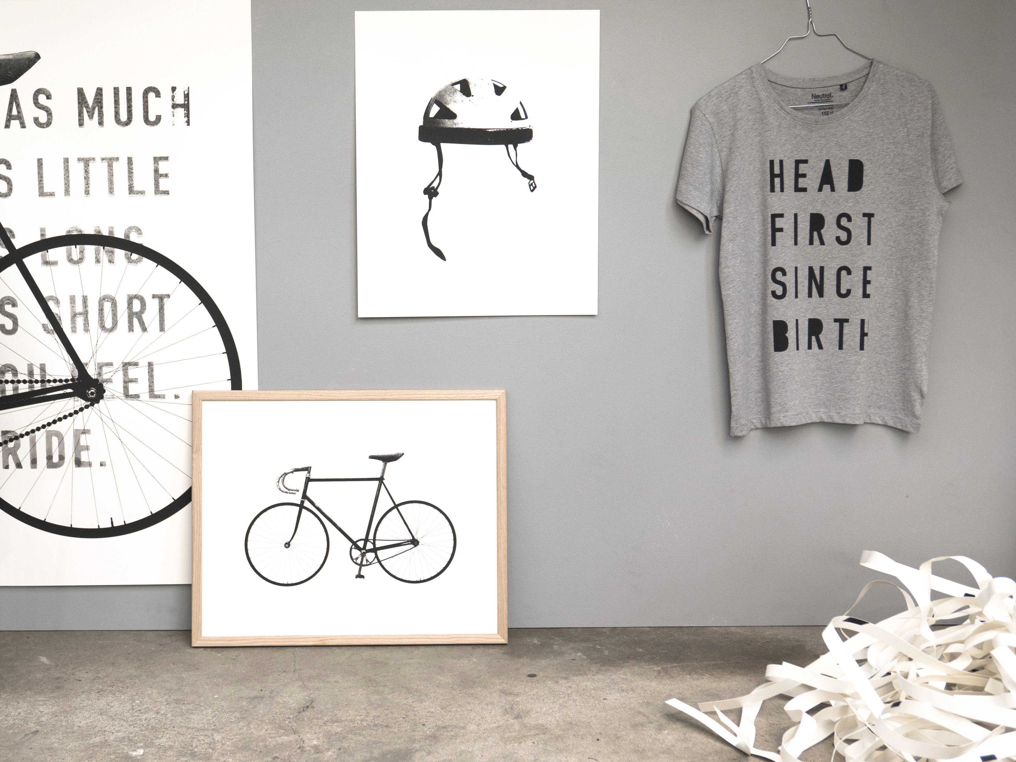
In this picture: Uniquefellow, Helmet, Headfirst and Ride
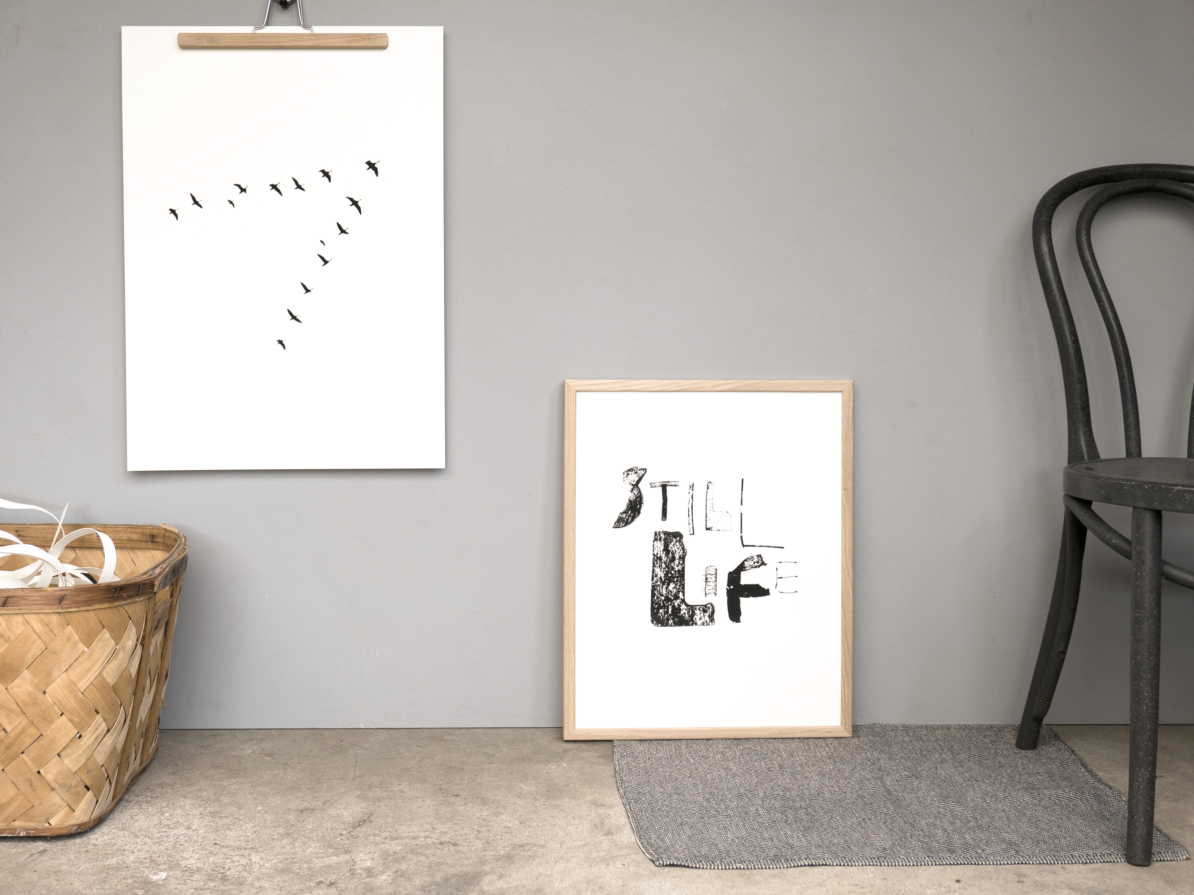
Flying V and Still Life
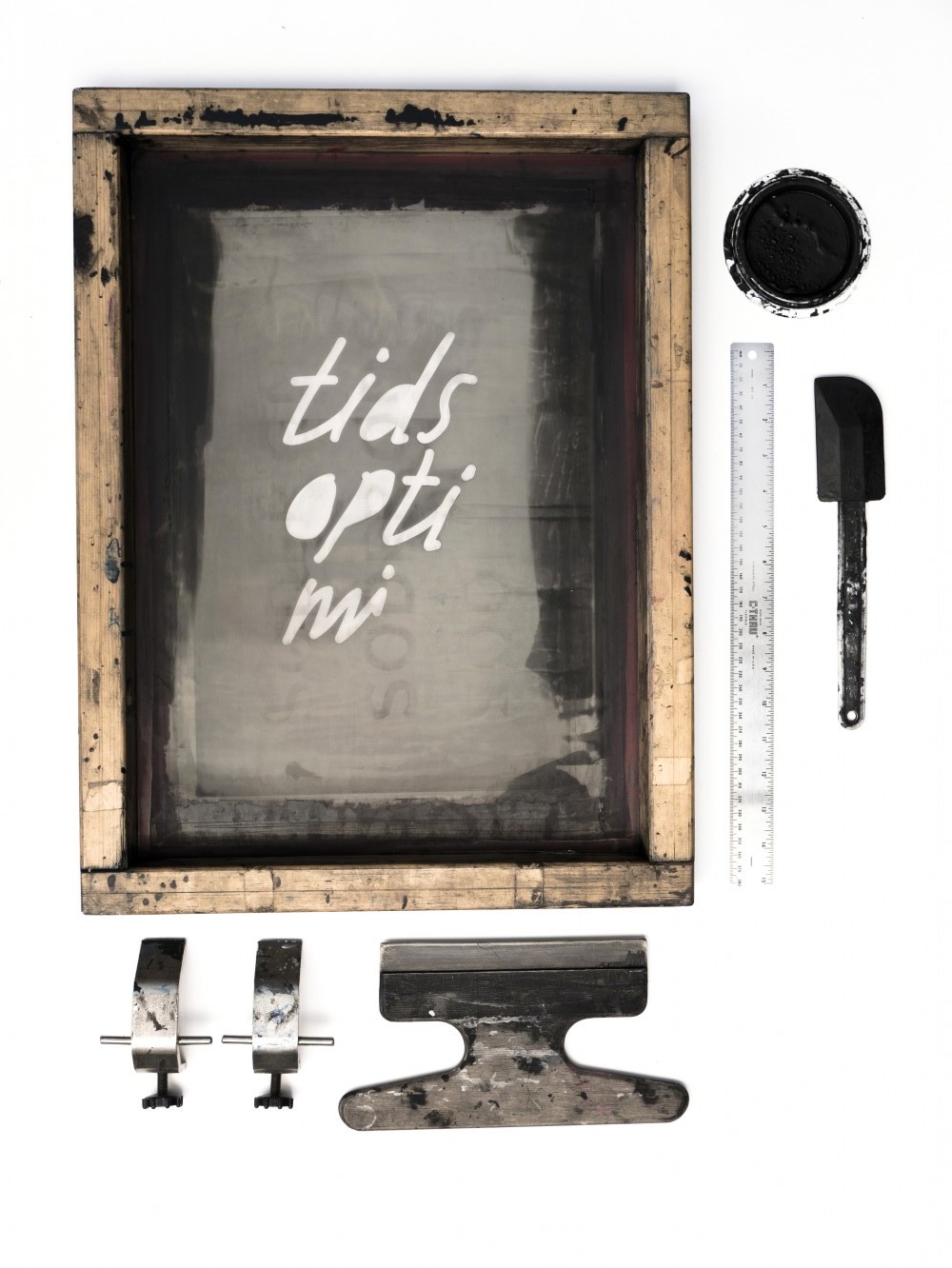
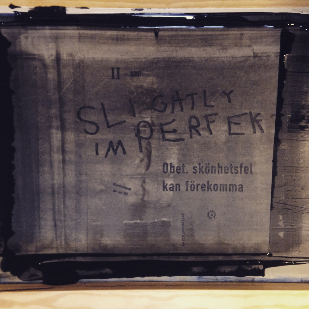
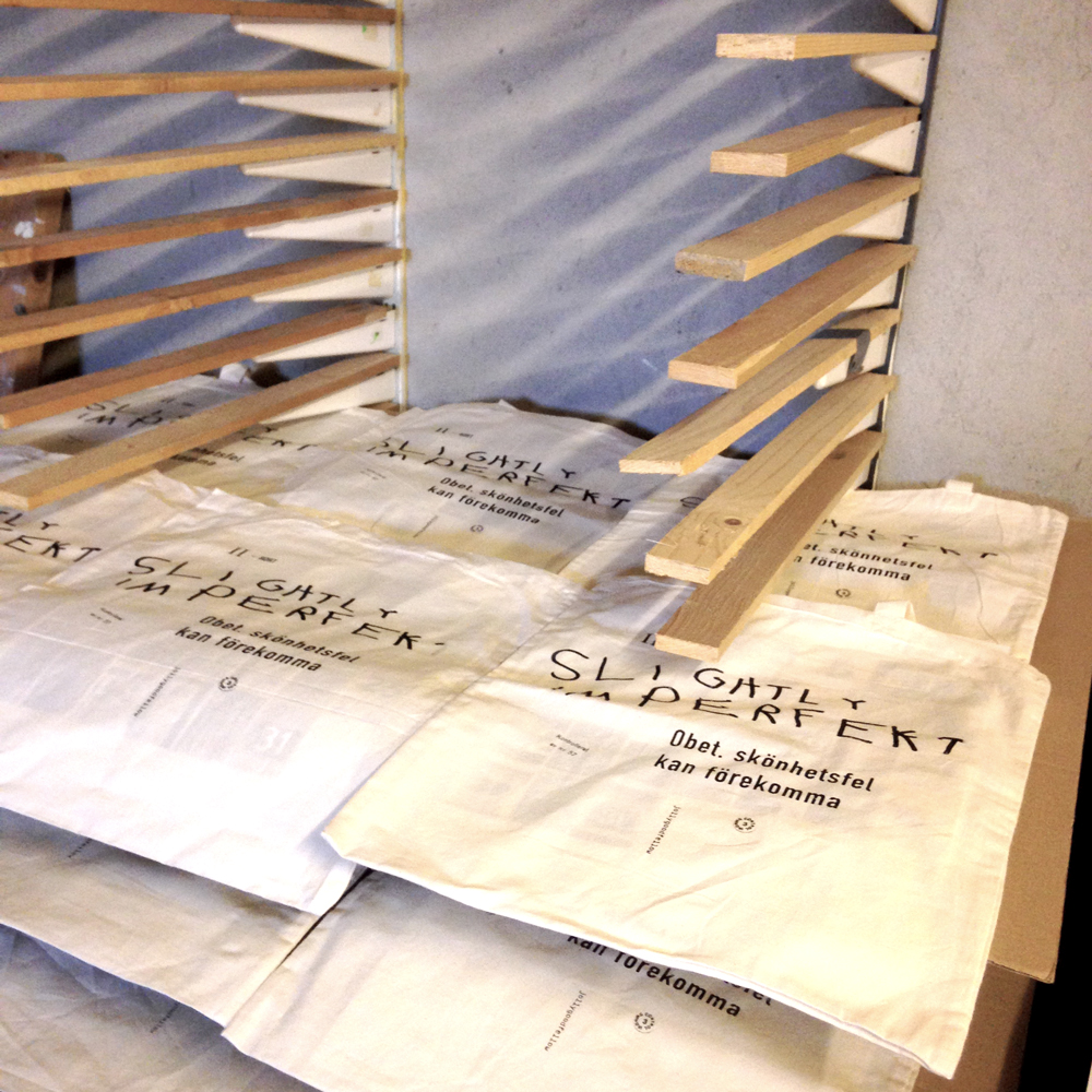
Some of our most important tools.
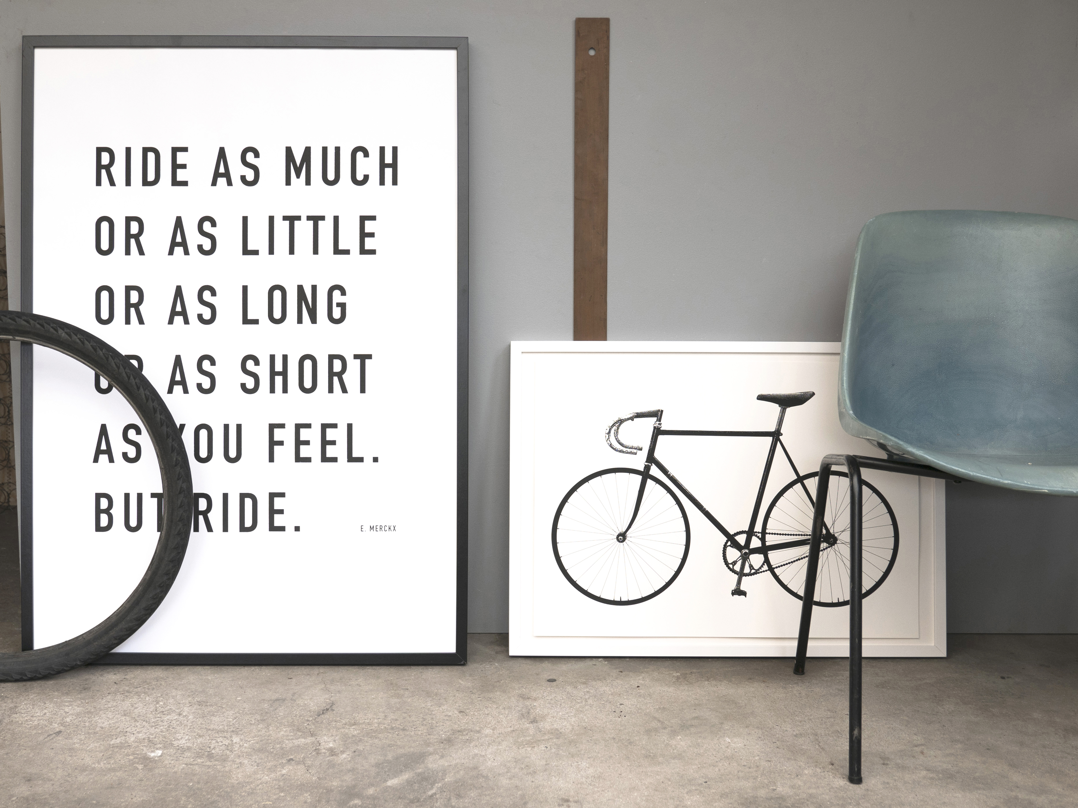
Ride Quote and Ride