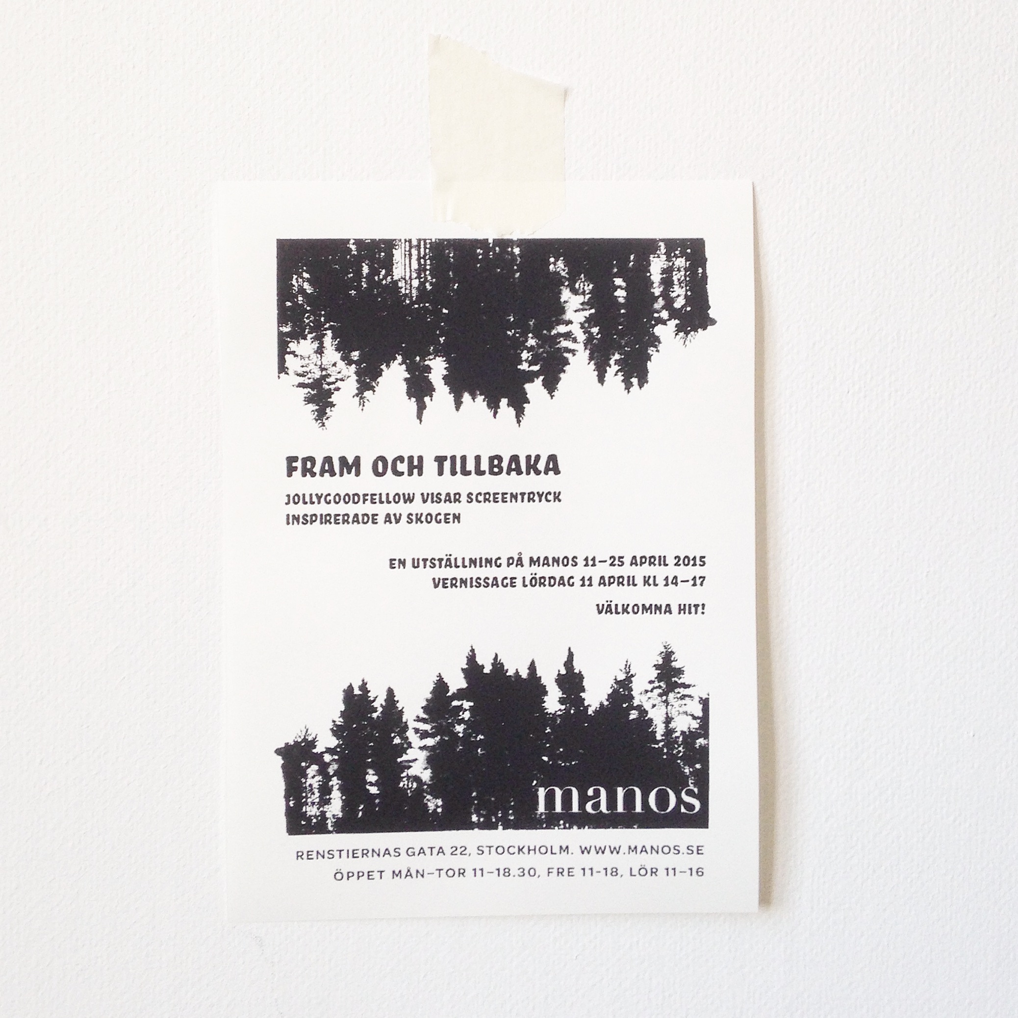
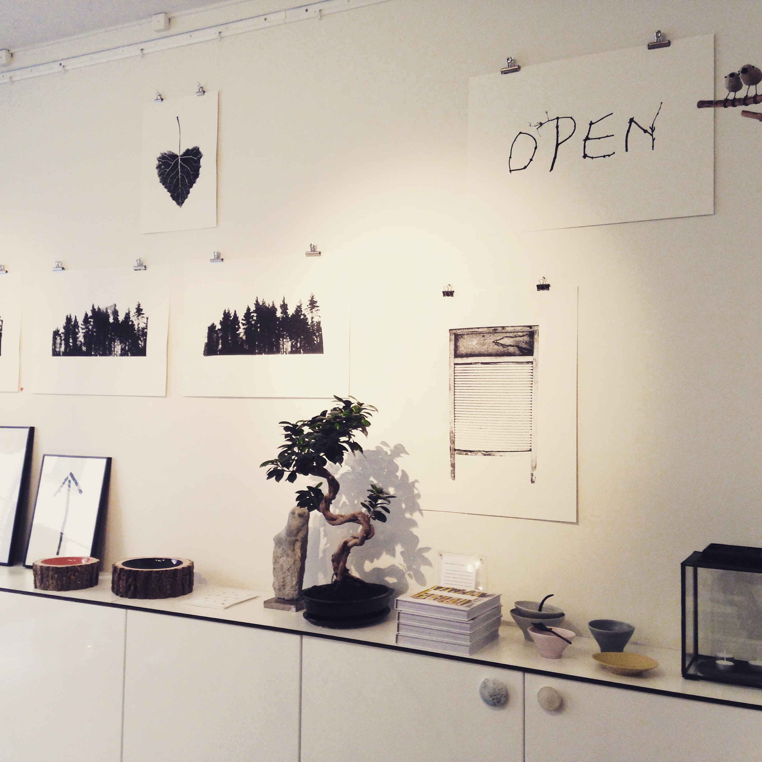
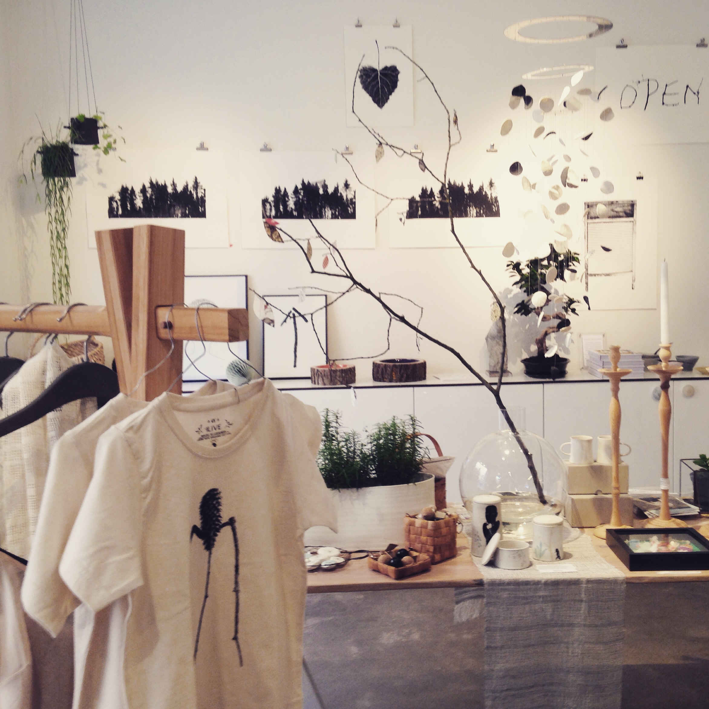
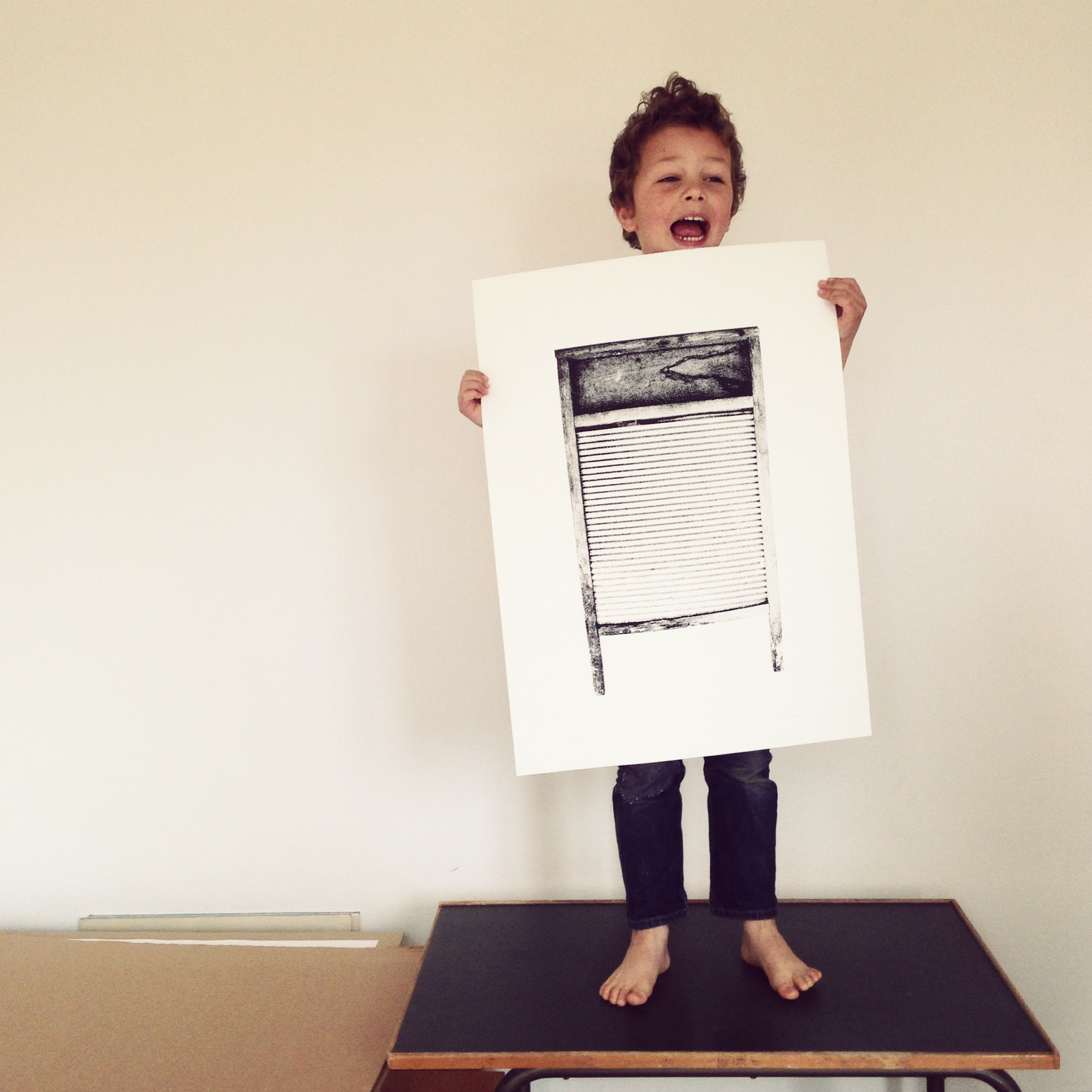
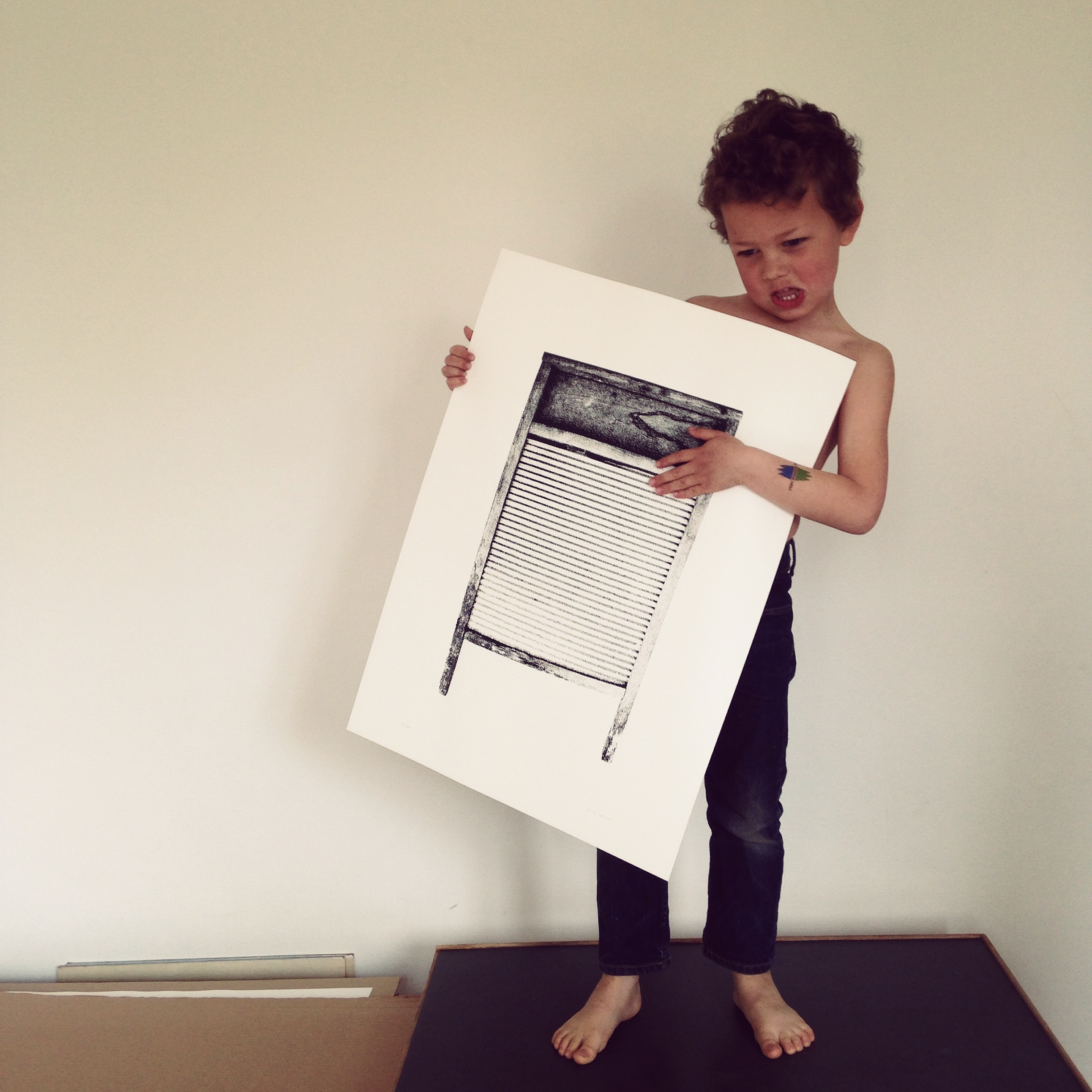
Tvättbrädan

Tvättbrädan-46x64_Wagon-P1000516

An old object that (almost) no one use any more. We found the original for this washboard in our cottage on the Finnish countryside some years ago. Probably Esa’s grandmother worked hard in the quite to get the cloths clean, back in the days. Sometimes its good to be reminded about how people used to value and take care of their cloths and objects, we have a lot to learn from the past when it comes to sustainable living.

Photo 2015-04-27 11 29 29

Photo 2015-04-27 11 29 09
It’s also fun to see how it can be used as a DIY-rhythm instrument.

And actually the first idea when we found the washboard, was to print t-shirts as a comment to the hysteria about our bodies. Let us know if your are interested, maybe we will print some t-shirts!

You can find Tvättbrädan in the jollygoodshop


Tvättbrädan_46x64_detail-P1000119 Tvättbrädan-46x64_Wall-P1000220

By |2020-04-17T11:17:25+02:00May 22nd, 2015|ON WALL|Comments Off on Tvättbrädan

Exhibition at manos!

Foto 2015-04-07 14 35 51

Manos in Stockholm started to sell our handprinted baby cloths many years ago. We love their mix of design and craft, actually they were our first reseller ever which makes them extra special. This spring we had the opportunity to hold an exhibition at manos and meet a lot of old and new friends.

Foto 2015-04-10 12 03 09

Foto 2015-04-10 12 12 06

Foto 2015-04-10 15 20 22

Foto 2015-04-11 17 11 39

Foto 2015-04-11 17 12 34

Foto 2015-04-11 14 21 20

By |2020-04-17T11:17:25+02:00April 24th, 2015|ON WALL|Comments Off on Exhibition at manos!

Världsmästarcykeln in new colours


Most of the time we use black paint in the printshop but it is something special with colour as well.

It’s really exciting when we stand there with the primary colors: cyan, magenta, yellow, white and black and try to concretize the idea of a colour we have in mind.


Here is the new colours, GREEN, BROWN and VIOLET

Världmästarcykeln Green, 64 x 46 cm, printed on Munken Pure.

Världmästarcykeln Brown, 64 x 46 cm, printed on Munken Pure.

Världmästarcykeln Violet, 64 x 46 cm, printed on Munken Pure.

By |2020-04-17T11:17:25+02:00February 27th, 2015|ON WALL|Comments Off on Världsmästarcykeln in new colours

Go!

goWe like bikes and typograpy – in this print we has combined them both, Go!

By |2020-04-17T11:17:25+02:00October 6th, 2014|ON WALL|Comments Off on Go!

Stålfarfar


It started as a play with bike parts and tools, but then we saw him – Stålfarfar! It made us very happy because we have read a lot about Stålfarfar and his story has been a great inspiration to us. Of course we had to make a screen print!

 Wikipedia says:

In 1951, at 66 years of age, Håkansson rode his bicycle emulating the so-called Sverigeloppet from Haparanda to Ystad. Because of his advanced age the organizers had refused him to participate – the maximum age was 40 years – but he still started from Haparanda, formally not among the contestants but starting one minute after the last of them had set off and wearing a shirt on which he had written a big zero as his ‘runner number’. The Tour was run in stages, and while the contestants slept, Håkansson would pedal up to three days without sleeping. During the contest, he was presented as “Stålfarfar”, a name that had followed him since the late 1940s. He had a big beard that made him look extra old, and the organizers were afraid people would laugh at the race participants. Many newspapers were covering his story, and he became famous as the nation followed his journey through the country.

During a few hours off in Söderhamn the police asked him to take a medical exam, which showed that Hakansson was in good health. After 6 days, 14 hours and 20 minutes, he arrived in Ystad – 24 hours before the contestants.


By |2020-04-17T11:17:25+02:00August 13th, 2014|inspiration, ON WALL|Comments Off on Stålfarfar

Urban Cube Calendar

The idea came up for the first time when we biked around looking for numbers for urbnCal 2012 in Helsinki, where many of the street numbers were placed on light cubes. One of the ideas with our wall calendar urbnCal was to make something physical in a digital world. In this calendar we are taking it one step further, the cubes are meant to be handled daily and turned to the current date. Another important part is that you can use it for many years, it’s a sustainable fellow.

12 street numbers screen printed by hand on quality cardboard from Norrmalms Kartongfabrik, glued together in the shape of cubes.
The calendar is inspired by Esa’s mother who every morning grabbed two small wooden cubes and turned to the date, then the weekday and sometimes the month. Our version of the calendar is reduced to just show the date to get a stronger and clearer expression.


By |2020-04-17T11:17:25+02:00August 10th, 2014|CALENDAR|Comments Off on Urban Cube Calendar

Greetings from Finland

We started the summer with a fantastic trip to the Finnish countryside. In a way, a journey through time as well, a trip to the days before running water and electricity (not totally, now and then we were able to borrow electricity and network, so some pictures from there are on instagram). What a feeling it is to carry wood and lighting a fire to get hot water and sauna or to fish up the lunch from the lake. We came home with a lot of new energy and inspiration from the exciting environments. Now we will continue working on some new prints for the Formex autumn fair mixed with salty water baths in the Baltic Sea, HAPPY SUMMER!

By |2020-04-17T11:17:25+02:00July 3rd, 2014|diverse, inspiration|Comments Off on Greetings from Finland

What is it good for?

We couldn’t said it better ourselves, so we borrowed the words of Edwin Starr (or Norman Whitfield and Barrett Strong who wrote the song “War”). We started to screen print it as black text on white paper (of course). We felt that it was someone else who said it, someone with a stronger voice than we have. So we did a calmer version – for us who don’t feel comfortable with shouting. We think the message gets through also in the more modest version. It was the first time we printed with white ink on grey paper and we think it turned out very well. The colours give us a nice old-office vibe. Maybe we will do more with that combination!

The posters also work one by one. The first poster leaves an empty space after the question which you can interpret as “absolutely nothing”. And if you want – poster number 2 can hang by itself an be an answer to a completely different (imagined) question.

And since we came to think of peace demonstrations, we made these two. Maybe we’ll go out on the streets with an old tape recorder with Edvin Starr singing out the message, if our patience runs out.

Peace!

By |2020-04-17T11:17:25+02:00May 7th, 2014|ON WALL|Comments Off on What is it good for?