JOLLYGOOD NOTEBOOKS

A pen on a piece of paper is something very special for us. Sometimes there is no app that can compete with a physical notebook.

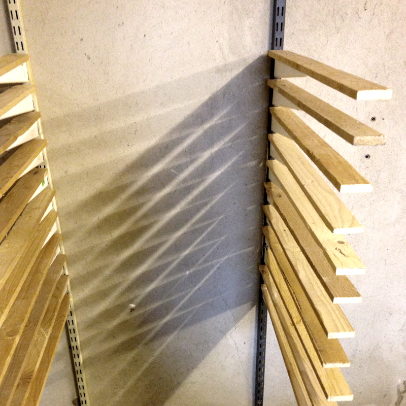
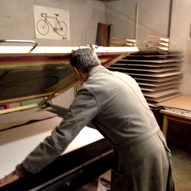
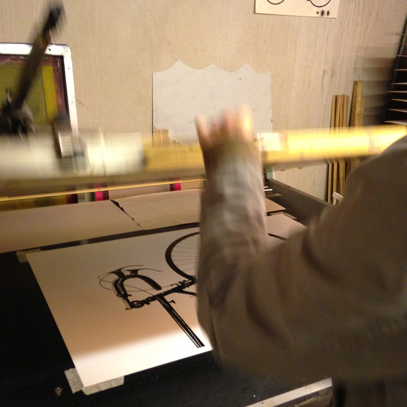
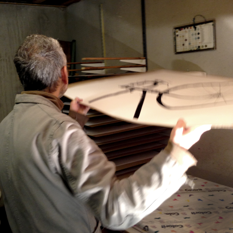
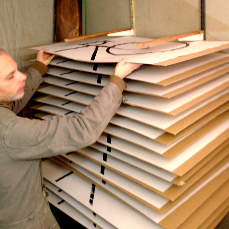
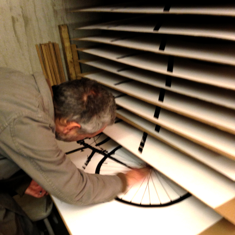
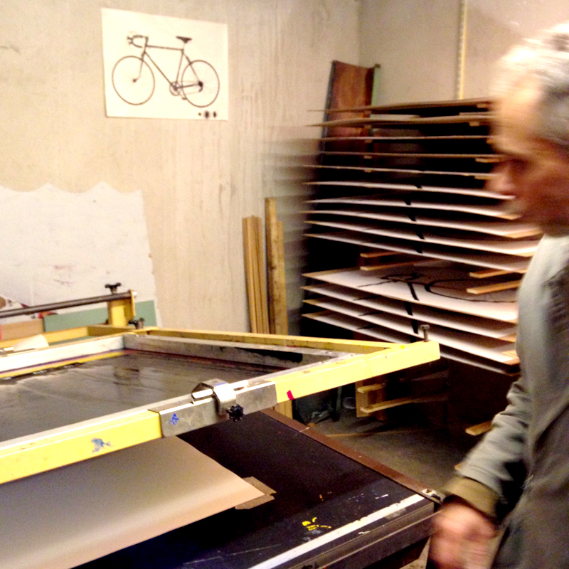
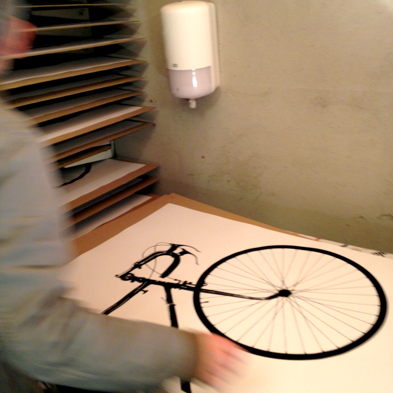
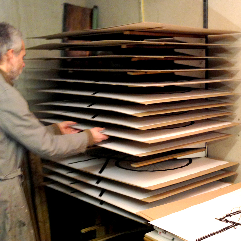
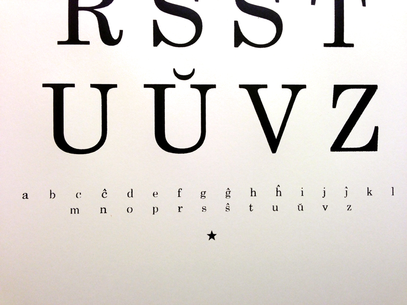
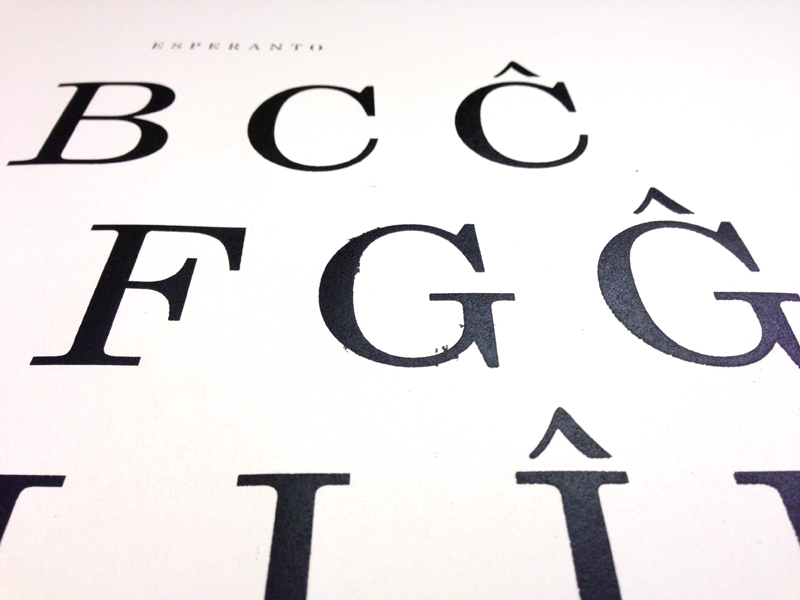
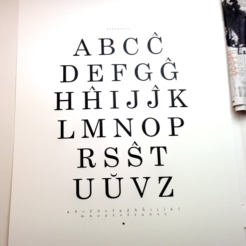
Here are nice pages from our wall calendar urbnCal and test prints  from the screenprint workshop given new life as covers for our notebooks. We cut up and select nice parts to match the cover.

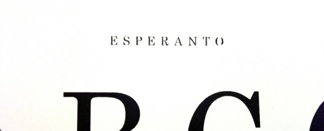
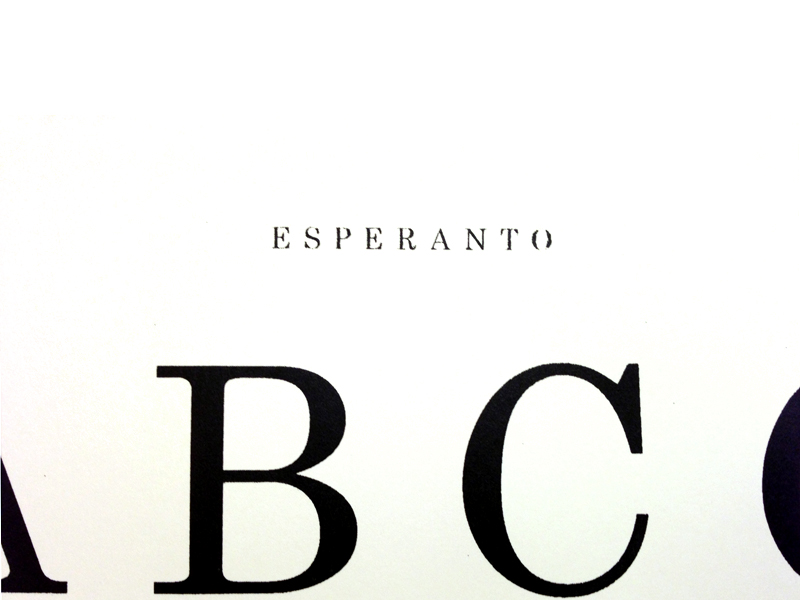
For the inlay we have felt our way through several papers to get to the ultimate, an uncoated paper that still isn’t too rough, but thick enough so that the ink doesn’t go through. We chose Munken Pure 100g, an environmentally friendly swedish paper. 64 pages in a practical A6 format (105 × 148 mm or 4.13 × 5.83 in) so it can slip down in your pocket or bag.

The box is made in Stockholm by norrmalmskartongfabrik a great place for paper nerds and screen printed by us. In the jollygoodfellow shop you find them as pack of 12 in a box or pack of 2.

This is notebooks our way, it’s JOLLYGOOD NOTEBOOKS!


By |2020-04-17T11:17:25+02:00January 11th, 2014|NOTEBOOKS|1 Comment

From stack to rack


This week we have planned and built a rack to dry our prints, mostly with things found in our basement. Afterwards we were eager to try it  and printed the first part of the bicycle poster. Usually its hard to find room for a  bunch of 70×100 cm sheets, but this worked really good!

We also found out that the roof was leaking just over the rack filled with new prints , but that’s another story.

Now there is hanging a bucket were the drops are falling. And we are looking forward to print the second part of the bicycle next week after some changes in the screen frame.

By |2013-11-03T23:05:43+02:00November 3rd, 2013|process|Comments Off on From stack to rack

Världsmästarcykeln (World Champion Bike)

Världsmästarcykeln XL ready

For us a bicycle is the optimal way to get around in a city! You get to know the city in a whole new way, and the city becomes easier to grasp.

The print Världsmästarcykeln!
The idea with this poster is to give the impression of having a real bike on the wall, therefore we wanted to print as close to natural size as possible. Our solution was to split the motif on two 70x100cm sheets.

We wanted to start from a classic racing bike, which for us feels a little like an icon for cycling. By a lucky chance there was a bike exhibition in our hometown of Malmö. We went there on the last day and snapped some pictures for inspiration. Immediately we felt that Harry Snell’s old worn Crescent would be perfect. One of the reasons was that Harry won the amatuer race in Valkenburg 1948 and after that Crescent was branded as the World Champion Bike for years, and the other that it simply had the right feeling.

But the pictures had a noisy background, so we had to spend many hours at the computer to create a nice bike silhouette. It was also the first time we screen printed a large format poster and we made many trials before we got it the way we wanted it. But now both of us absolutely agree that it was worth all the hard work!


Inspiration on the wall

The bike can demonstrate an active and healthy lifestyle (or the dream of it) . It can stand for freedom and taking responsibility for our world’s future through a minimal environmental impact.

At the bike exhibition in Malmö

The photographer and the bike.

The poster on the wall.

There is something very aesthetical with bicycles, graceful and subtle at the same time, and graphical!


——

Update:
Many of you seem to have enjoyed our effort and the edition of  Världsmästarcykeln XL  is sold out.

We have now a new bike print called Ride, read more about it here or have a look in the jollygood shop!

By |2020-04-17T11:17:26+02:00October 22nd, 2013|ON WALL|2 Comments

Esperanto

Ĉu vi parolas Esperanton? (Do you speak Esperanto?)

It’s really fascinating this ambitious idea to create a new language to foster harmony between people. Esperanto is, after 125 years, still spoken, but I guess English is hard to compete with (which we also use on this web site). If it wasn’t for M. A. Numminen we might not have thought about it  that much. But a language he knows and even sings in must be worth a hand silkscreened poster!

Esperanto is the most widely spoken constructed international auxiliary language. Its name derives from Doktoro Esperanto (“Esperanto” translates as “one who hopes”), the pseudonym under which L. L. Zamenhof published the first book detailing Esperanto, the Unua Libro, on July 26, 1887. Zamenhof’s goal was to create an easy-to-learn and politically neutral language that transcends nationality and would foster peace and international understanding between people with different regional and/or national languages.

wikipedia

This poster is part of a series we are working on that explores the graphic expression of languages (and the relationships between people) with the starting point in Sweden, where we live.

Buy it here in our shop!

See also ABÇ-plansch.


By |2020-04-17T11:17:26+02:00December 11th, 2012|ON WALL|1 Comment

Sisaret poster

Sisaret is the Finnish word for sisters, you can read more about the print  “Sisaret” and have a look at the tote bag – version here.

The poster is  screen printed by hand on heavy off-white (Munken Pure 240g) uncoated swedish paper.
Size: 46×64 cm (18×25 inches) Stamped title and  signed with pencil (which you can also see in the picture below).

Available here !


By |2020-04-17T11:17:27+02:00September 1st, 2012|ON WALL|Comments Off on Sisaret poster

ABÇ-plansch (poster)

abcdsc_0122

For us it has been a lot of numbers in recent years, so now it’s time for some characters.

The inspiration for this print comes from our new hometown Malmö (in the southern part of Sweden). A city where about 50% of the population has other native languages than Swedish. The ABÇ-plansch, an extended abc-poster, is our way of celebrating the great variety of expressions and a chance for us to enjoy exiting graphic shapes.

The selection is based on form and we have focused on the Latin alphabet and languages found in Europe. After some research we had an overwhelming amount of characters, to get the abc-feeling we kept 26 at a large size and placed the rest in three lines at the bottom of the print.

abcdsc_0086

abcdsc_0111

abcdsc_0084

abcdsc_0085

We think this print fits in a kids room (since today’s gifted kids already know how to read before they start kindergarten 😉 or to anyone who enjoy a graphic look.

Paper: Munken Pure 240g
Edition: Numbered 200
Print: Screen printed by hand
Typeface: Museo Sans
Design: L. E. Tanttu – jollygoodfellow, Sweden

Available at Supermarket and Nordic Design Collective.

By |2020-04-17T11:17:27+02:00May 16th, 2012|ON WALL|1 Comment